





Variants
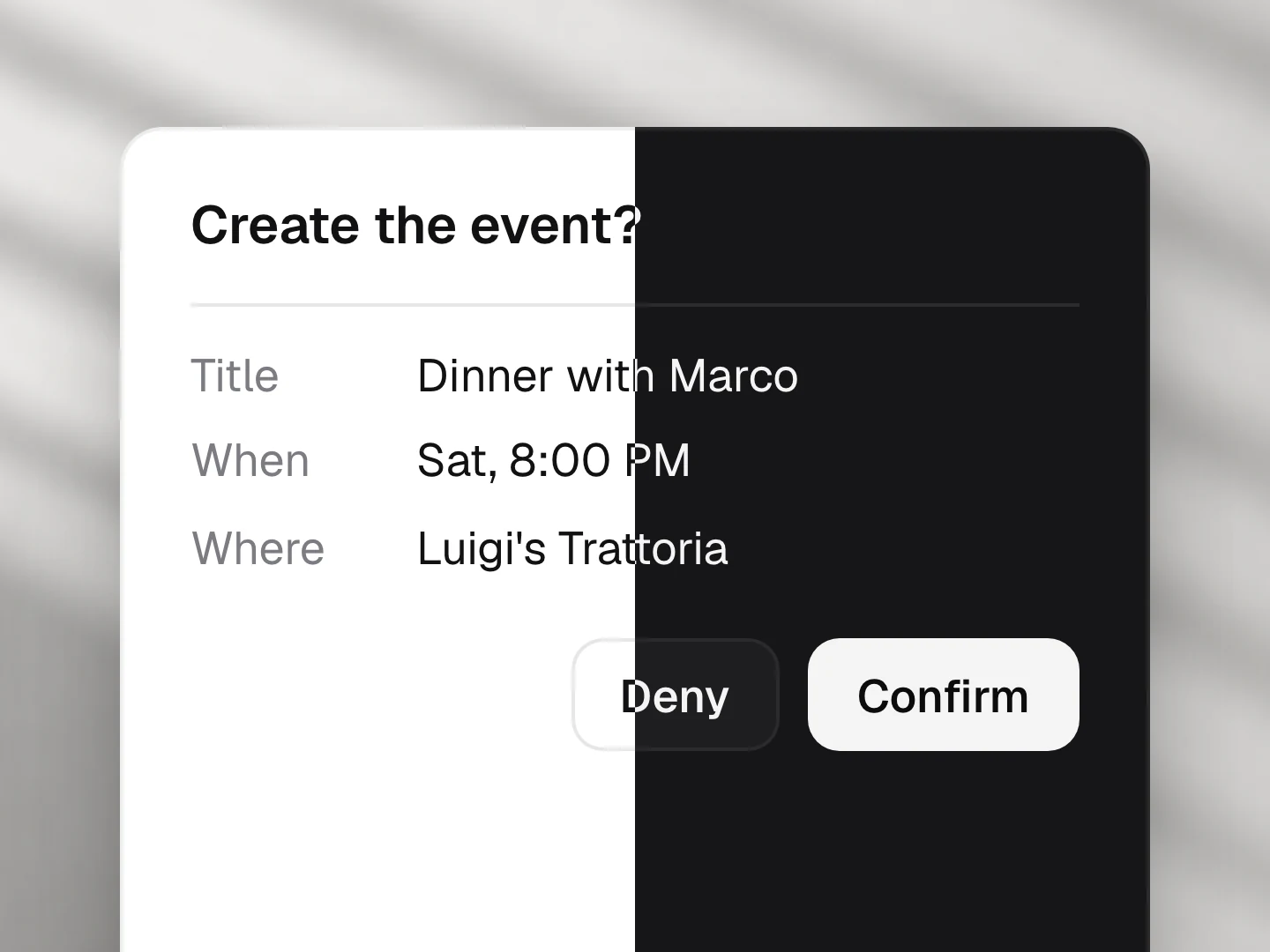
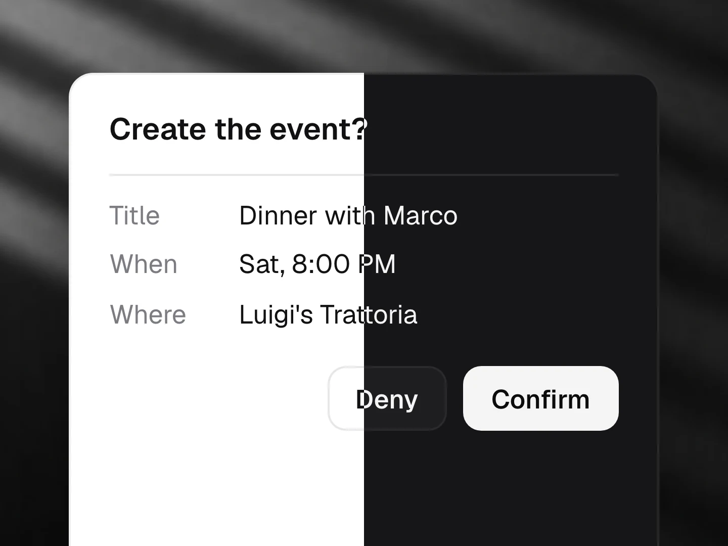
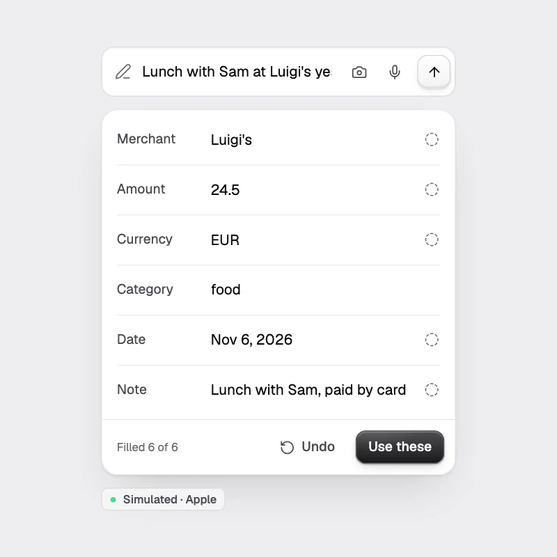
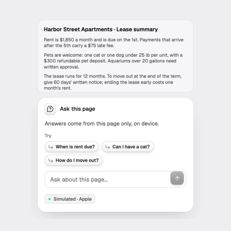
Every component exposes typed variants: presentation, variant, size, radius, accent, density and theme.
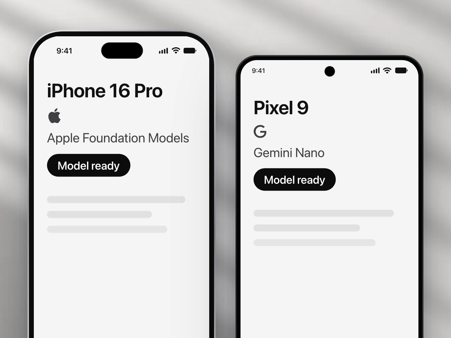
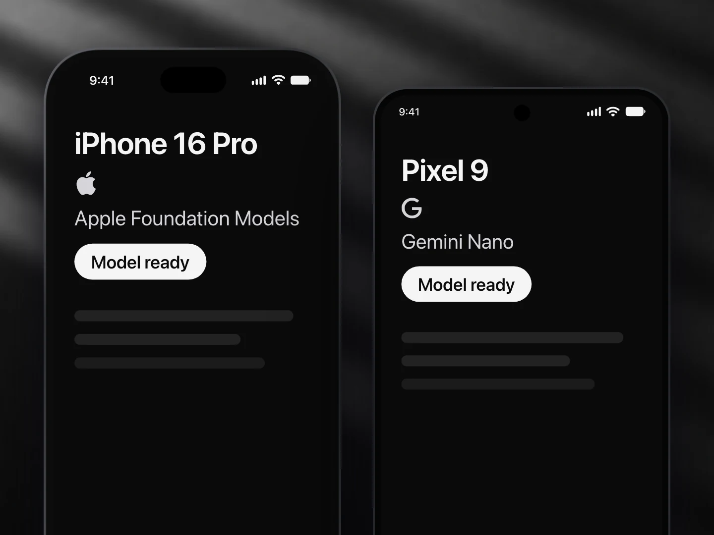
Variants use a tiny cva-style helper over React Native style objects. The same code runs on iOS, Android and the web, no compiler plugin:
import { createVariants } from '@ondai/tokens'

const chip = createVariants({
  base: { borderRadius: 999 },
  variants: { size: { sm: { height: 28 }, md: { height: 34 } }, variant: { soft: {}, outline: {} } },
  defaults: { size: 'md', variant: 'soft' },
})
chip({ size: 'sm' }) // → style[]
chip.options.size     // → ['sm', 'md']
Each component documents its own presentation (structure: spotlight, sheet, inline, pill…), variant (look: glass, solid, minimal, soft, outline, ghost…) and size. Every component has its own page in Components.