Command bar
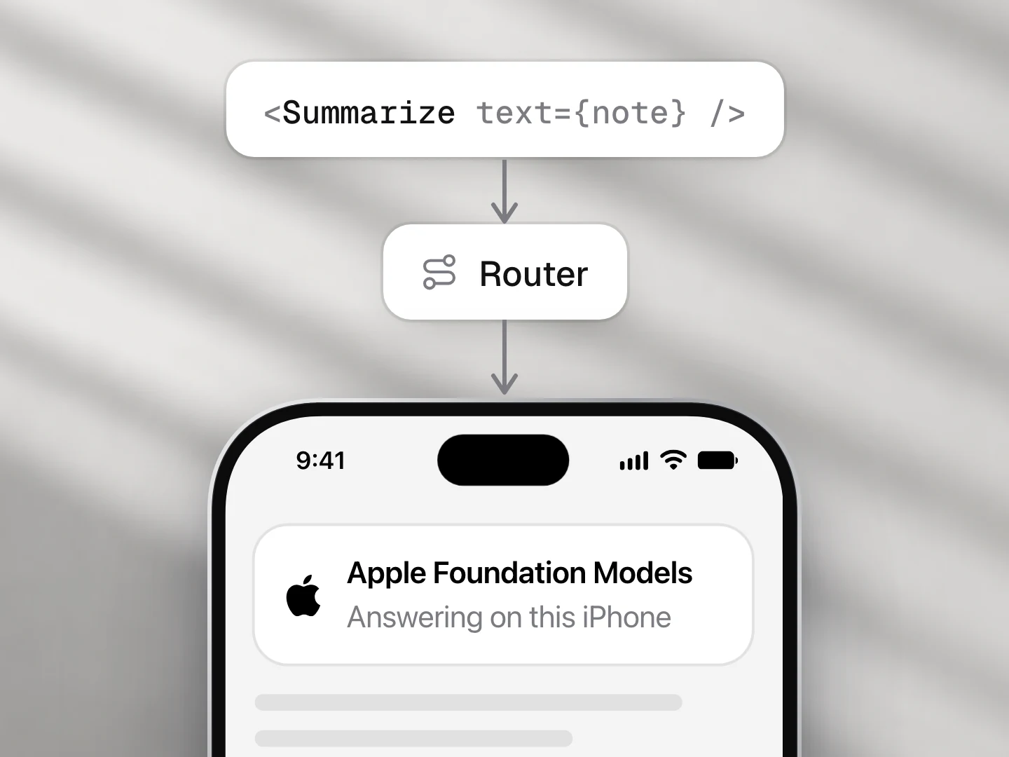
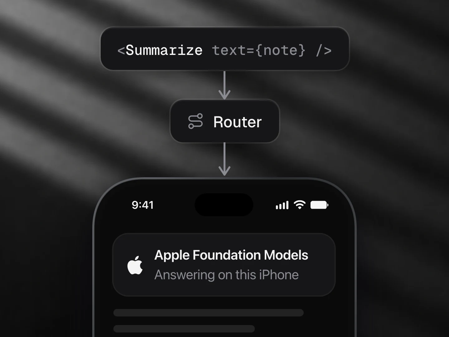
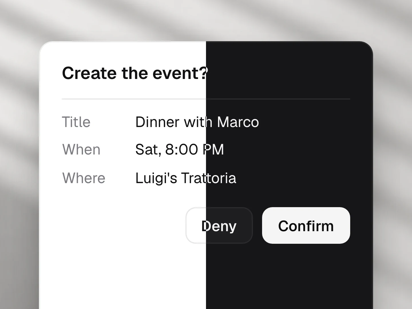
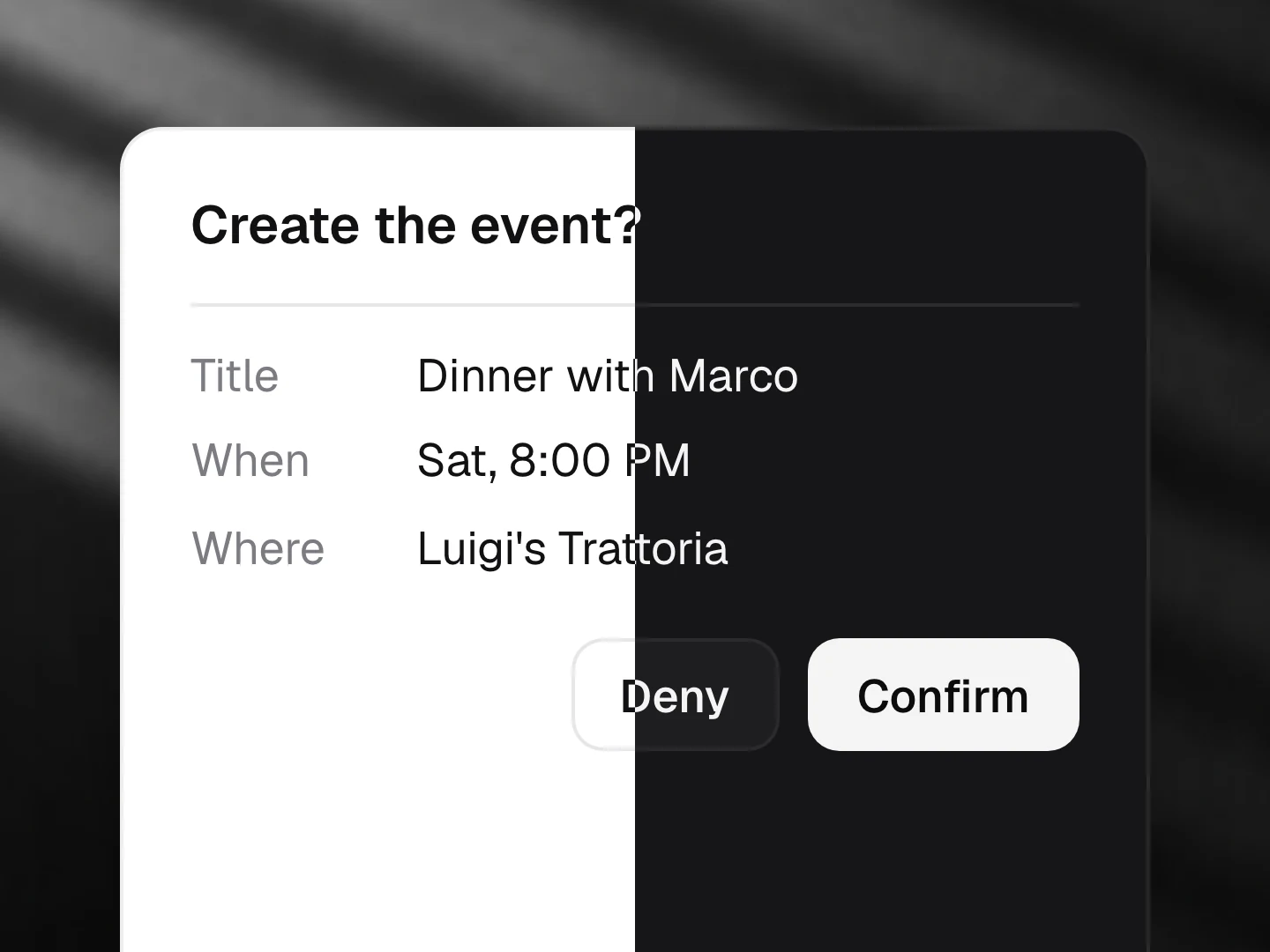
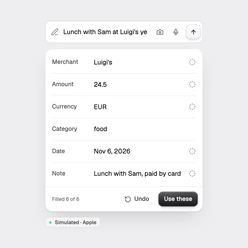
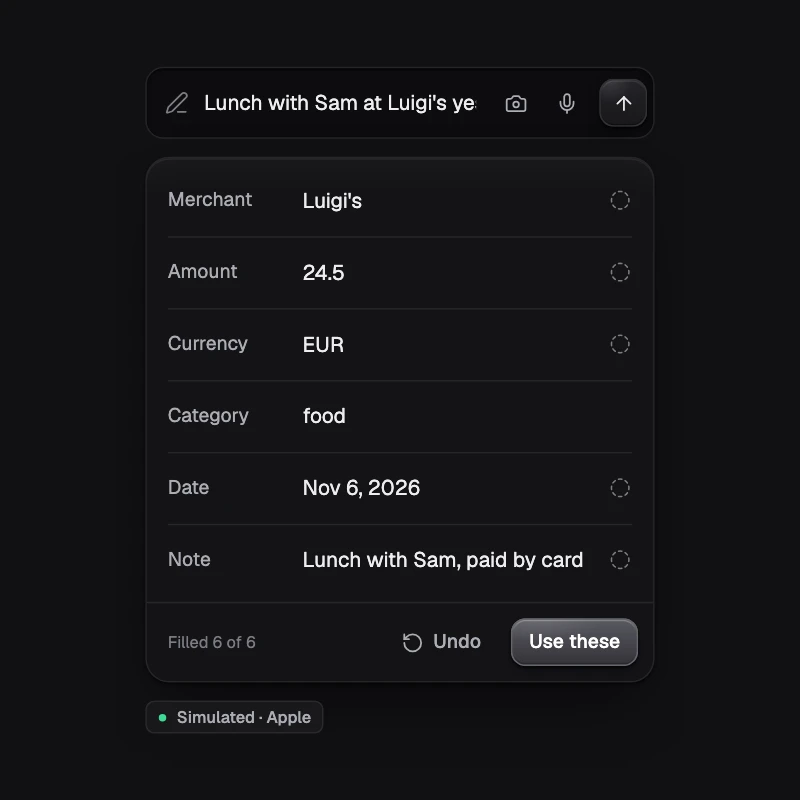
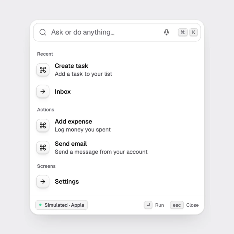
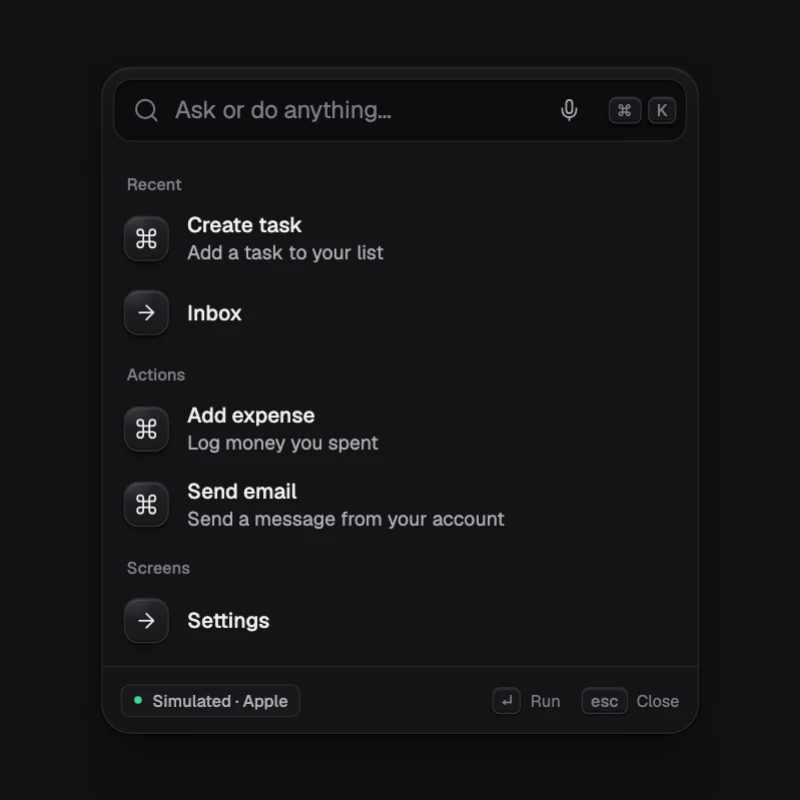
Spotlight for your app: natural language becomes one of your registered actions or routes, chosen by on-device tool calling, with preview and confirmation.
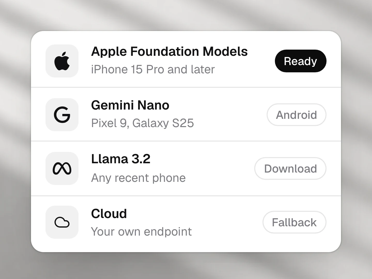
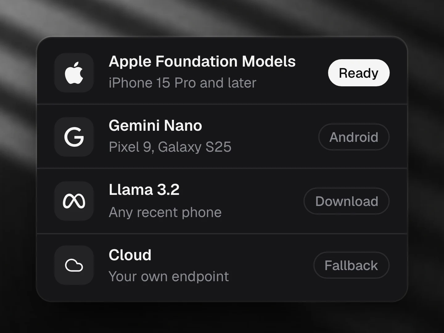
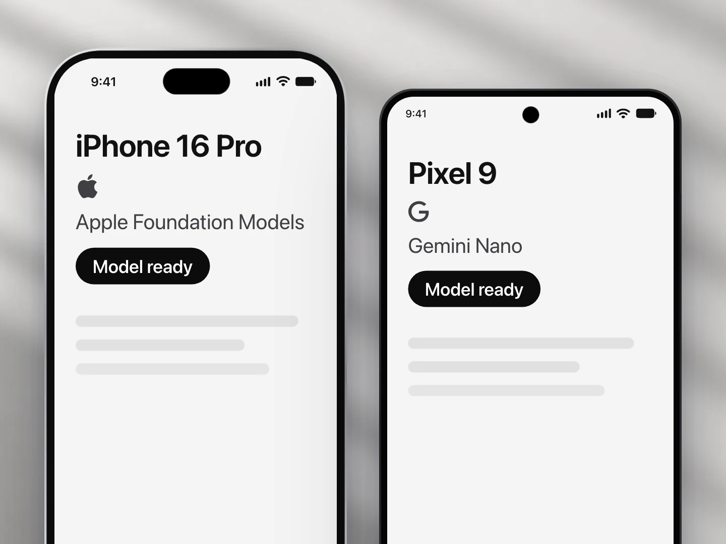
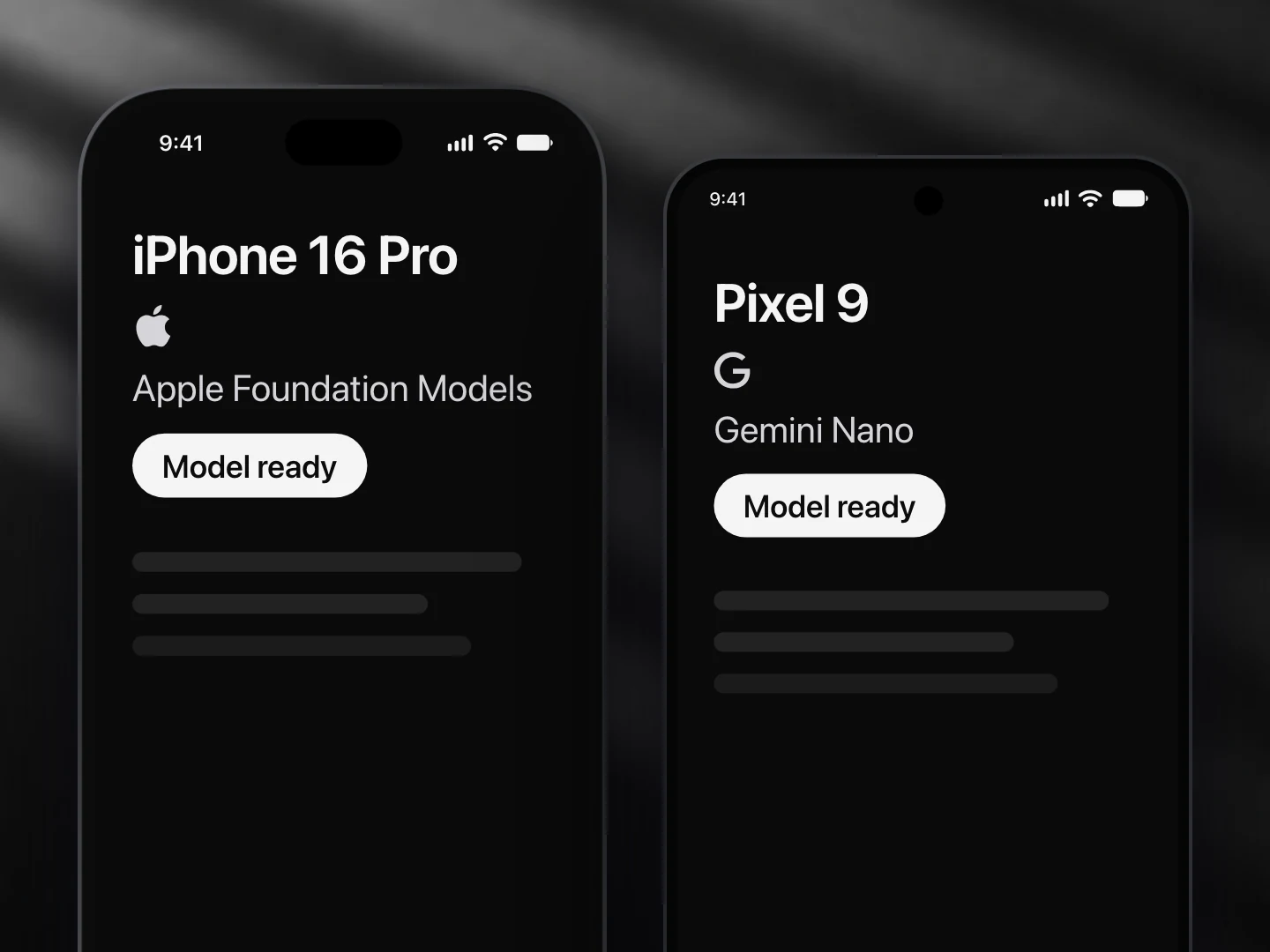
- Apple Foundation Models: supported
- Gemini Nano: supported
- Llama (not yet supported): not supported
- A cloud model: supported
- On Gemini Nano it picks the action from structured output instead of tool calls.
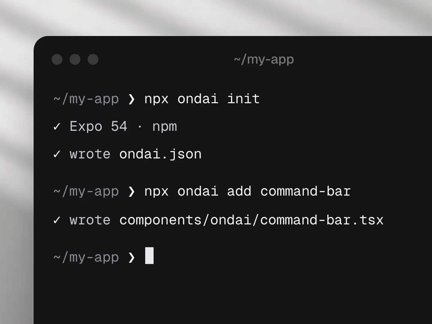
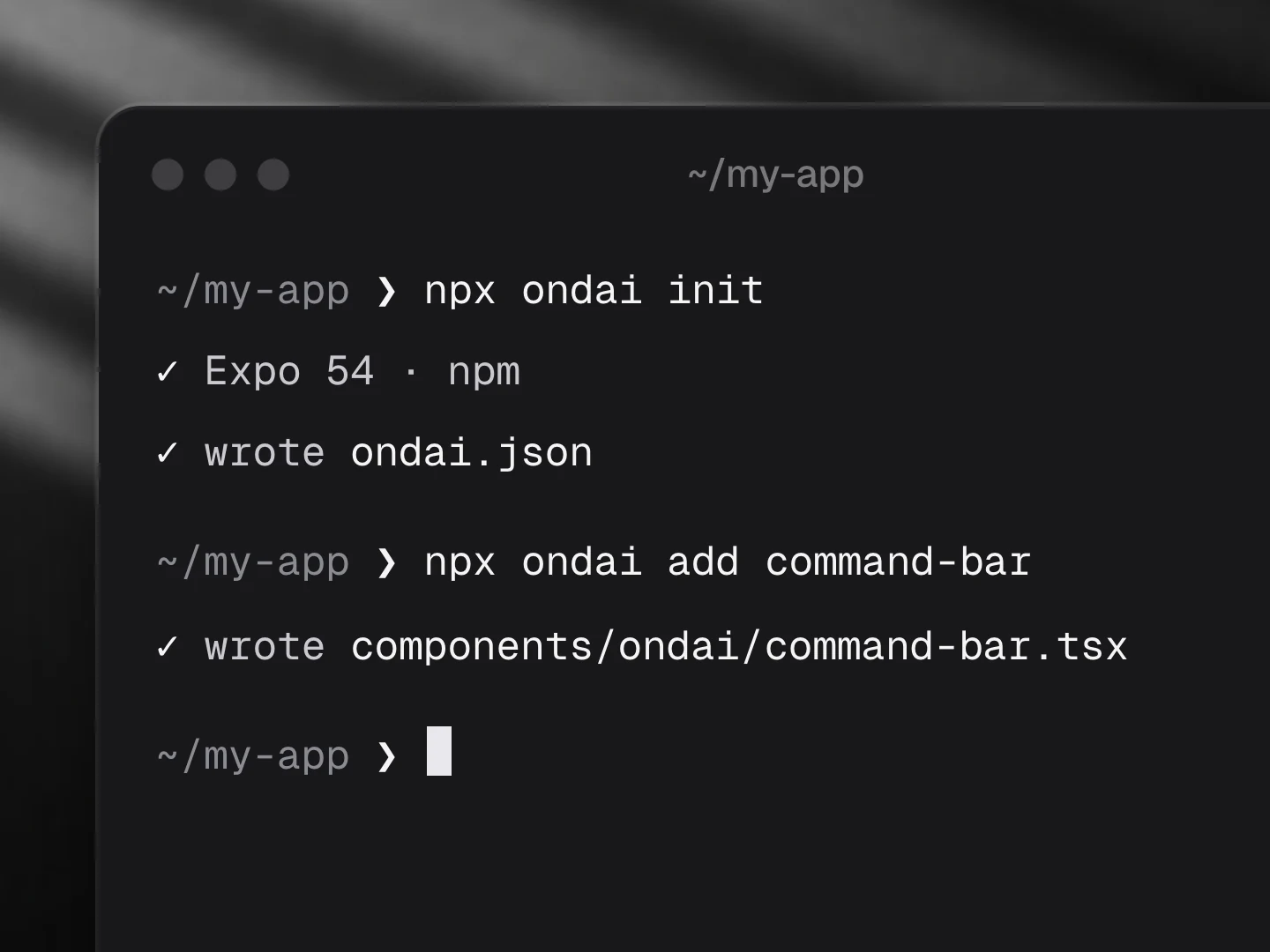
Install
npx ondai add command-barUsage
import { CommandBar, defineActions, defineAction } from '@/components/ondai/command-bar'
import { z } from 'zod'

const actions = defineActions([
  defineAction({
    id: 'task.create', title: 'Create task', keywords: ['todo', 'remind'],
    params: z.object({ title: z.string(), due: z.string().optional() }),
    preview: (p) => `Create task · ${p.title}`,
    run: (p) => tasks.add(p),
  }),
  defineAction({ id: 'email.send', title: 'Send email', risk: 'high', params: z.object({ to: z.string(), subject: z.string() }), run: sendEmail }),
])

<CommandBar actions={actions} presentation="spotlight" variant="glass" open={open} onOpenChange={setOpen} />- Ladder: on-device tool calling → structured enum choice → keyword search. Something always answers.
- Actions with
risk: "high"pause in a ToolConfirmCard before running. - Use
routesToActions(routes, router.push)to expose expo-router screens.
Customize
Every AI component takes the same look and customization props, so it fits your app rather than ours.
<CommandBar
  variant="pop"
  tint="#FF5A5F"
  size="lg"
  radius={12}
  icons={{ search: Search, voice: null }}
  labels={{ placeholder: '…', thinking: '…' }}
/>| Prop | What it does |
|---|---|
variant | The look of the whole component: clean, minimal, glass, pop, candy, metal, shine |
size | sm, md, lg; type, rows, icons and keys scale together |
tint | Any colour; the variant paints its keys, tiles and glow in it |
radius | Corner radius of the container |
icons | Replace any icon (a lucide component, an element, or null to hide it): search, voice, thinking, action, screen, item, stepDone, error, confirm, result, resultTrailing, open |
labels | Every visible and spoken string; defaults are exported as commandBarLabels: placeholder, thinking, retry, cancel, approve, needsApproval, run, close, recent, suggestions, groupActions, groupScreens, groupItems, empty, openButton, closeButton, inputLabel, voiceLabel |
| Slots | Draw a part yourself: renderIcon, renderAction, renderResult, renderConfirm, renderEmpty, renderFooter |
styles | Style any named part |
Variants
| Prop | Options |
|---|---|
presentation | spotlight, sheet, inline, pill, fullscreen |
variant | clean, minimal, glass, pop, candy, metal, shine |
size | sm, md, lg |
Token budget
Input budget: 1200 tokens. Top 5 tools preselected by keyword relevance; the query is truncated to the budget.
Fallback
When no provider is ready the component renders the unavailable state (AvailabilityGate copy) and, where a deterministic path exists, keeps working without the model.
Eval score
Fixtures: evals/command-bar/fixtures.json.
Files
Registry dependencies: button, key-hint, on-device-badge, sheet, shimmer-text, skeleton, streaming-text, surface
npm dependencies: @ondai/core, @ondai/tokens, expo-haptics, lucide-react-native, react-native-reanimated, zod