Photo caption
A photo in; a caption and accessibility alt text out, written by the on-device vision model. Streamed, editable, copyable, and handed back as alt text.
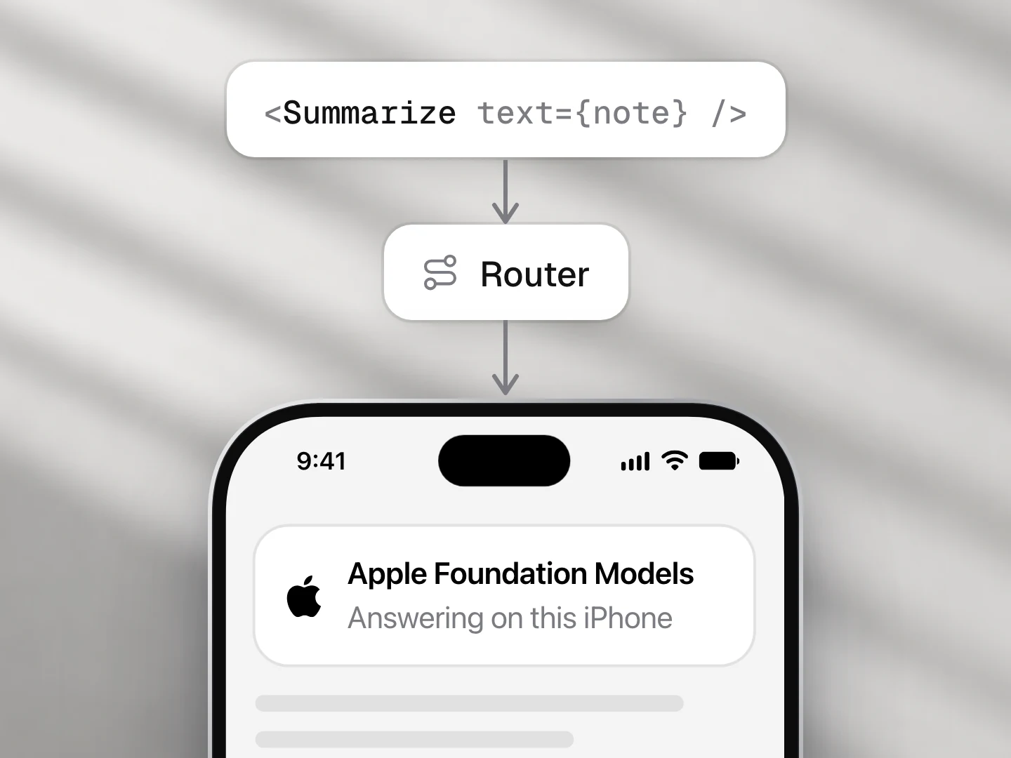
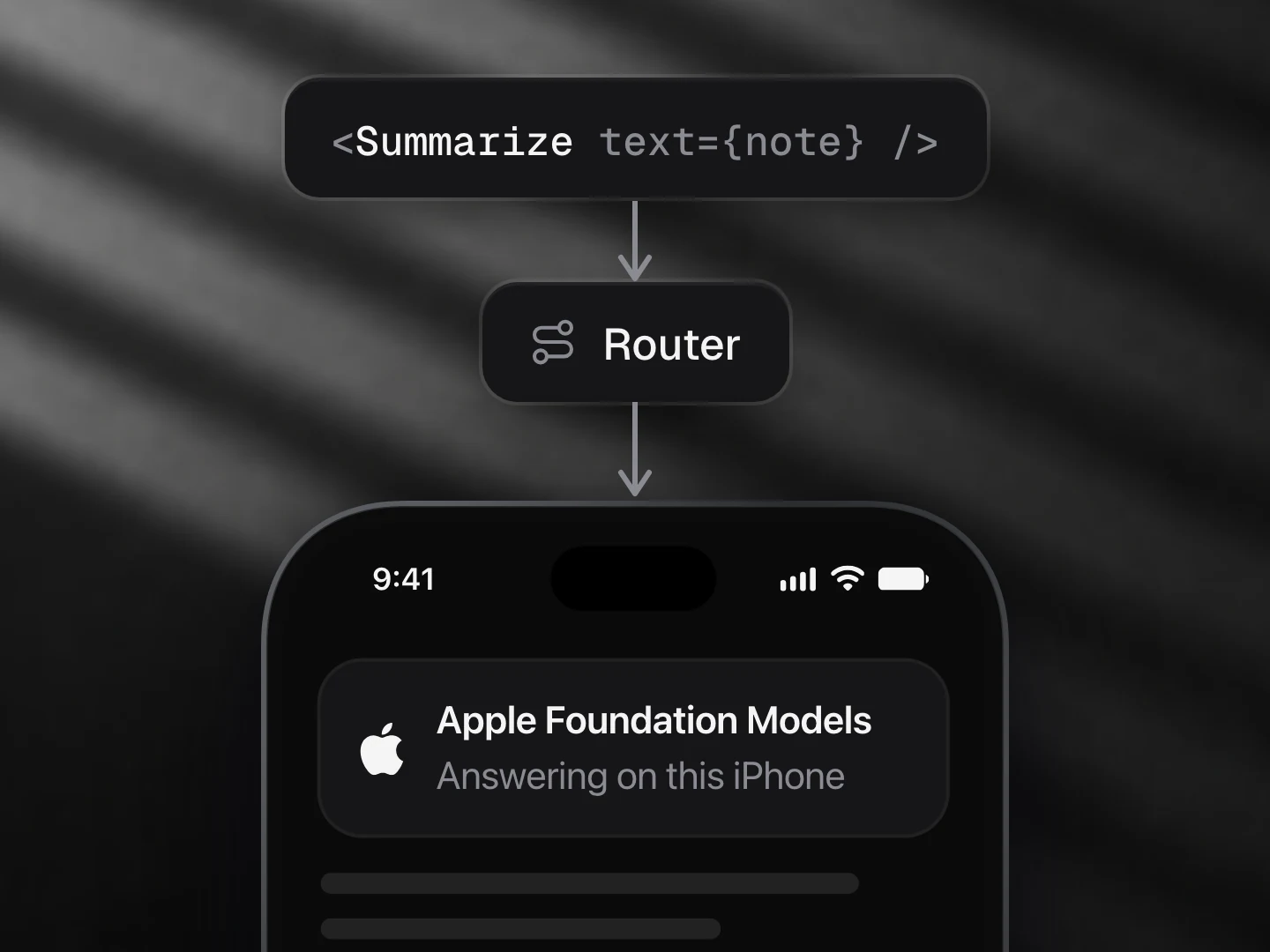
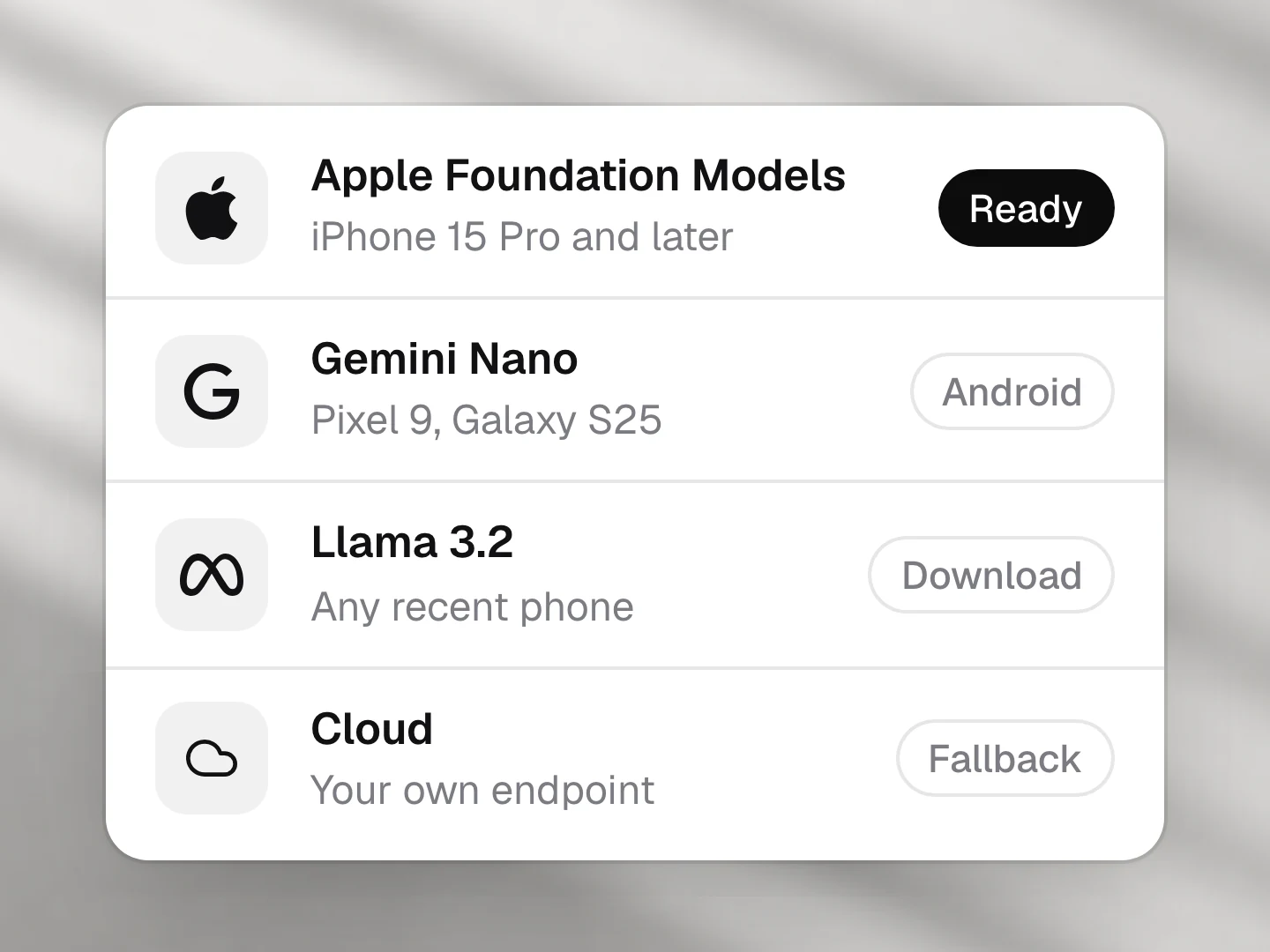
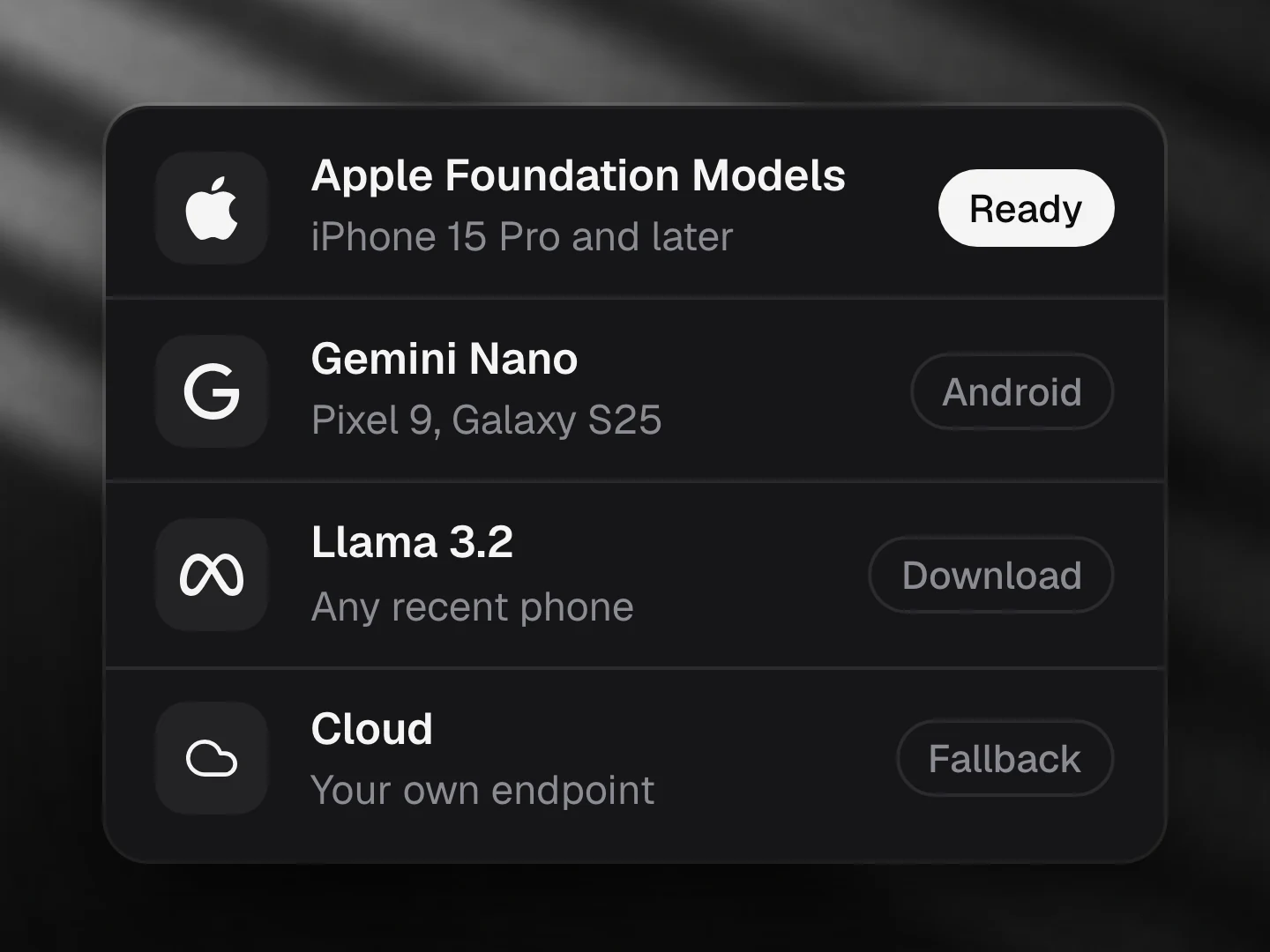
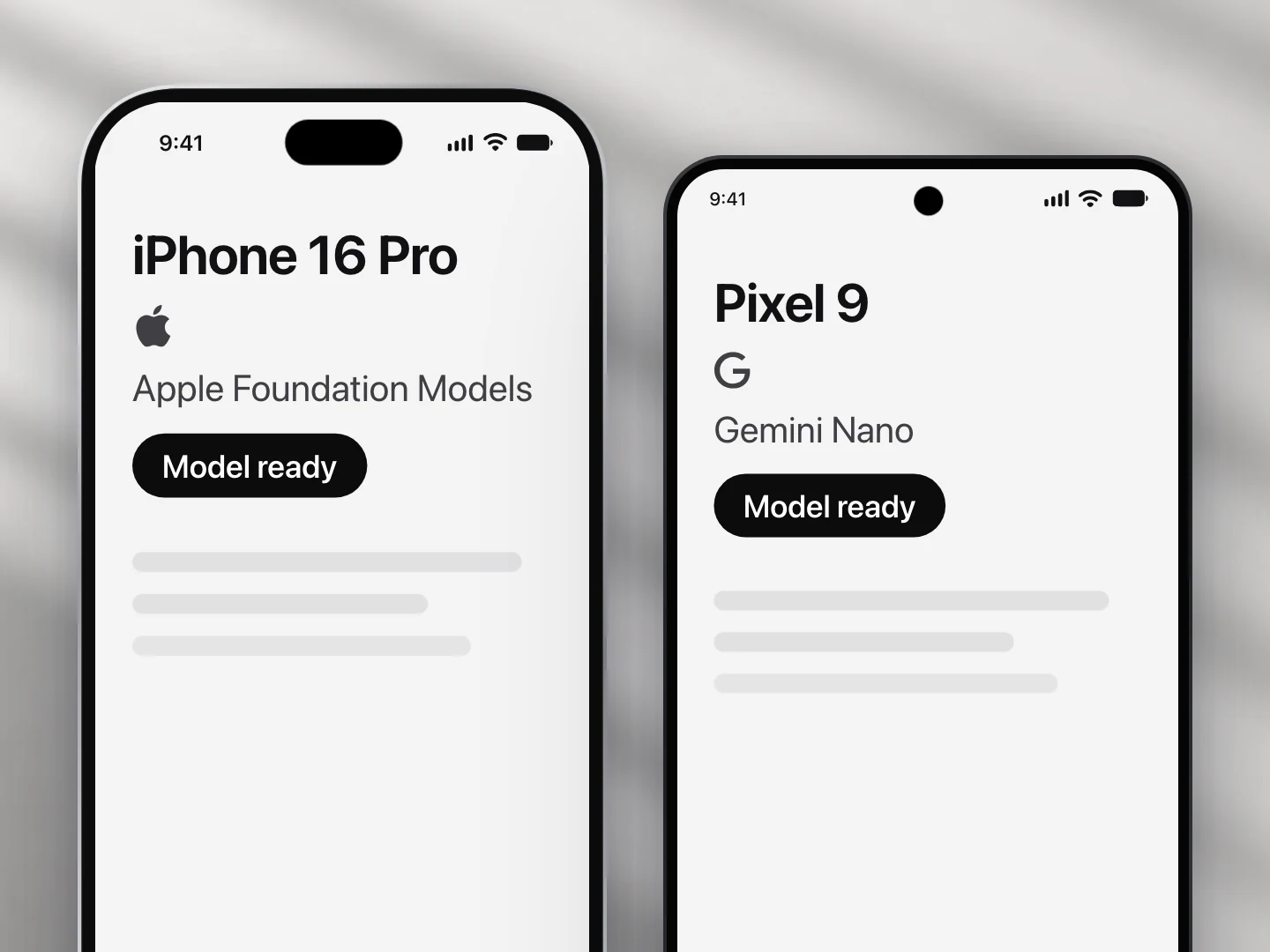
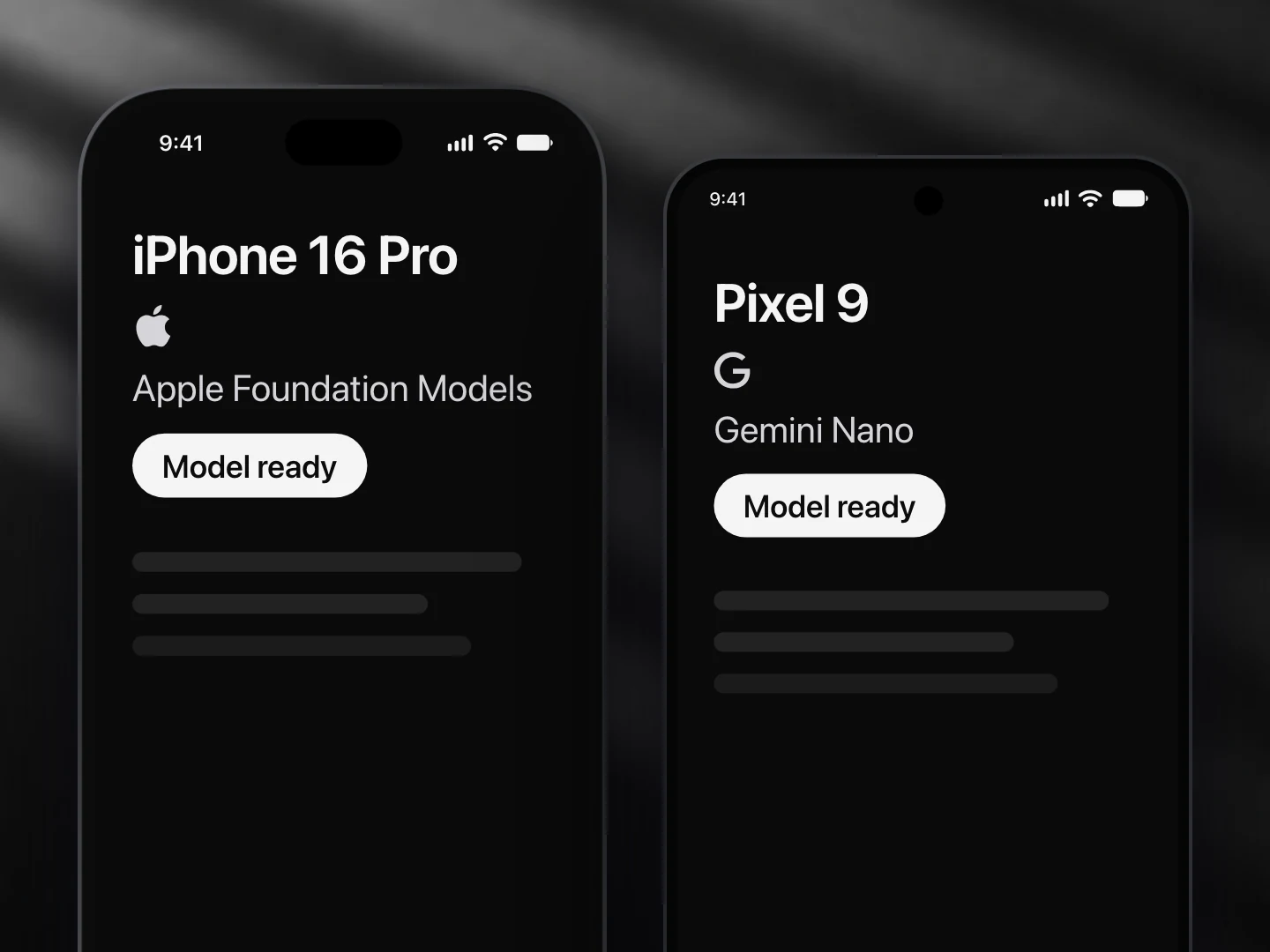
- Apple Foundation Models: not supported
- Gemini Nano: supported
- Llama (not yet supported): not supported
- A cloud model: supported
- Not on iPhone yet: Apple's model takes images from iOS 27, and the provider package Ondai uses does not pass them on yet. Runs on Gemini Nano (Prompt API, beta) or a cloud model.
Install
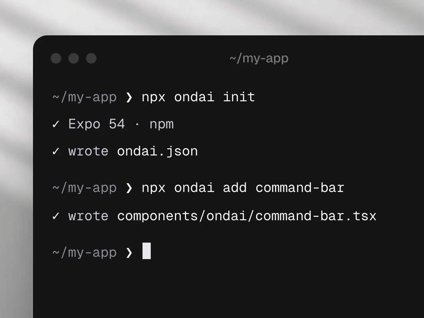
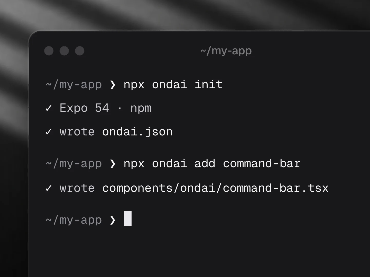
npx ondai add photo-captionUsage
import { PhotoCaption } from '@/components/ondai/photo-caption'

<PhotoCaption
  image={{ uri: asset.uri, base64: asset.base64 }}
  tone="warm"
  onUseAlt={(alt) => post.setAltText(alt)}
/>- The photo goes to the on-device vision model and never leaves the phone. One streamed reply carries both outputs: the caption streams in first, then the alt text below it.
- Leave out
imageand the component offers to take or choose a photo (expo-image-picker).onImagetells you which one. - Both outputs can be edited once written. "Use as alt text" calls
onUseAltwith the edited alt text; each output has its own copy key. - Alt text is cleaned up deterministically ("Image of…" is dropped) and gets a gentle note past
maxAltLength(125 by default). presentation="tabs"shows one output at a time with a toggle;stackedshows both.- Headless:
usePhotoCaption()returnscaption,alt,writing,status,run(image),setCaptionandsetAlt.
Customize
Every AI component takes the same look and customization props, so it fits your app rather than ours.
<PhotoCaption
  variant="bevel"
  tint="#3B82F6"
  size="lg"
  radius={16}
  icons={{ useAlt: Accessibility, camera: null }}
  labels={{ caption: 'Caption', alt: 'Description' }}
/>| Prop | What it does |
|---|---|
variant | The look of the whole component: clean, minimal, glass, pop, candy, metal, shine, bevel |
size | sm, md, lg; type, the photo, icons and keys scale together |
tint | Any colour; the variant paints its keys, tiles and glow in it |
radius | Corner radius of the card |
tone | Voice of the caption: plain, warm, playful (the alt text is always objective) |
icons | Replace any icon (a lucide component, an element, or null to hide it): empty, camera, library, run, copy, copied, useAlt, again, retry |
labels | Every visible and spoken string; defaults are exported as photoCaptionLabels: caption, alt, empty, idle, takePhoto, choosePhoto, run, thinking, writingCaption, writingAlt, count, tooLong, copy, copied, useAlt, usedAlt, again, retry, error, preparing, photo, changePhoto |
| Slots | Draw a part yourself: renderEmpty, renderField, renderError |
styles | Style any named part: container, photo, empty, field, fieldLabel, text, footer |
Variants
| Prop | Options |
|---|---|
variant | clean, minimal, glass, pop, candy, metal, shine, bevel |
presentation | stacked, tabs |
size | sm, md, lg |
tone | plain, warm, playful |
Token budget
Input budget: 1200 tokens. One image plus a short instruction; a single streamed reply of two labelled lines (caption, alt) parsed as it arrives.
Fallback
Needs a provider with the vision capability. When none is ready the component renders the unavailable state (AvailabilityGate copy), or the download progress while a model is preparing. A refusal is shown calmly, without a retry key.
Files
Registry dependencies: button, model-download, on-device-badge, shimmer-text, skeleton, streaming-text, surface
npm dependencies: @ondai/core, @ondai/tokens, expo-clipboard, expo-haptics, expo-image-picker, lucide-react-native, react-native-reanimated