Tone check
Reads the tone of a draft as you type (friendly, neutral, blunt or tense, casual to formal) and offers a one-tap softer rewrite when it reads off.
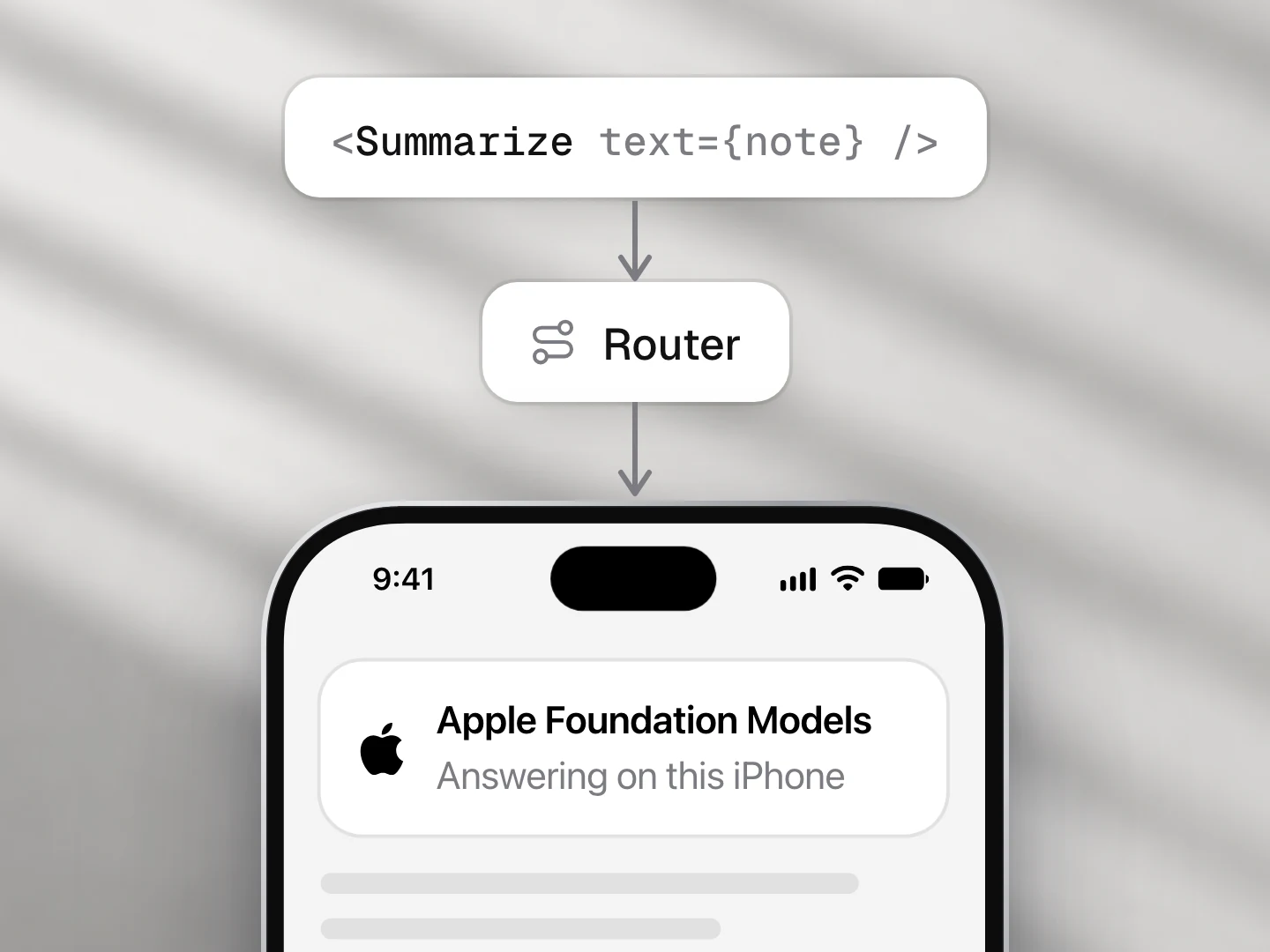
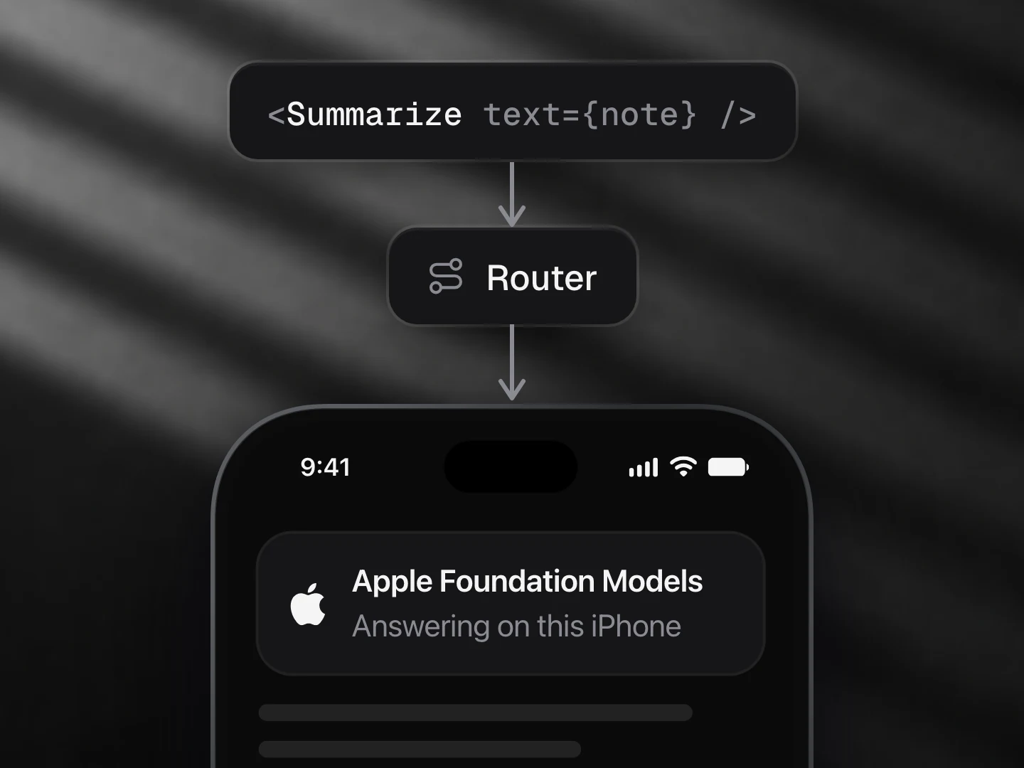
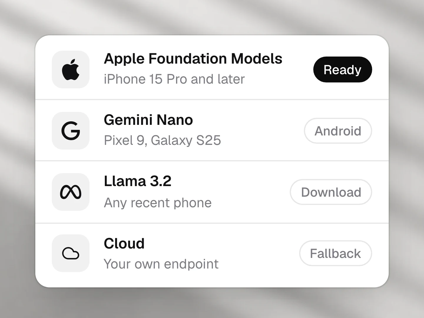
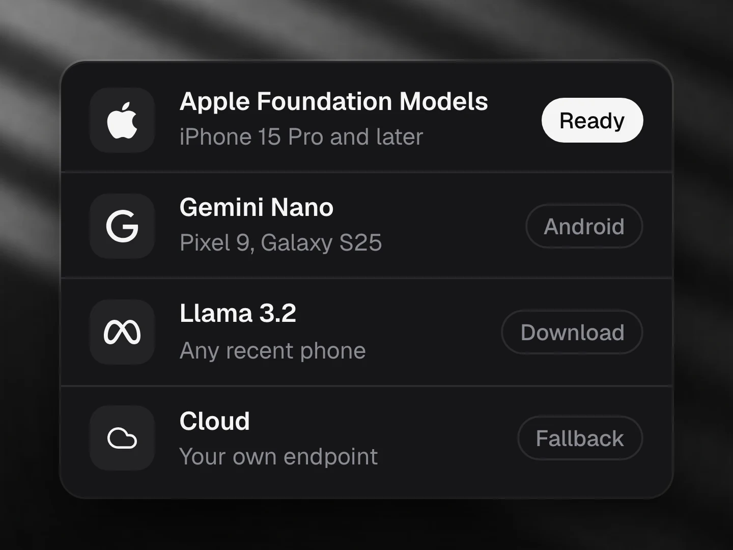
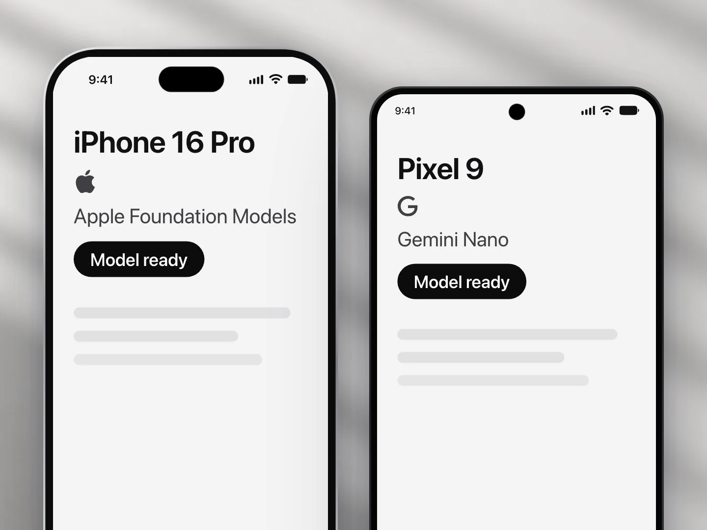
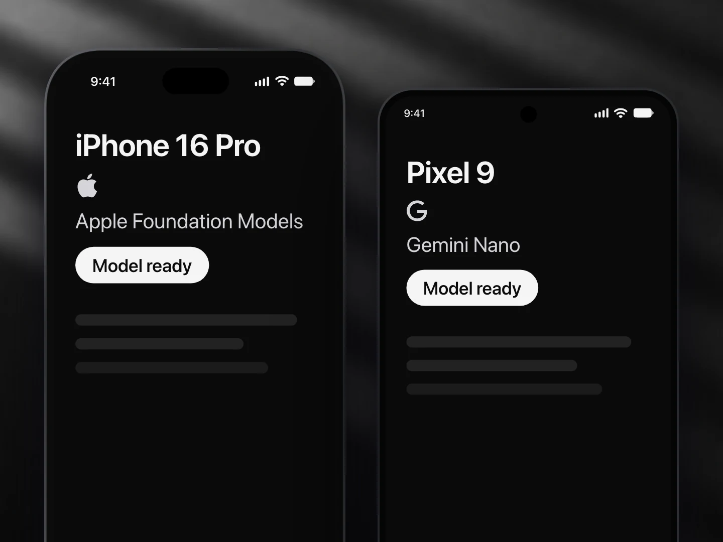
- Apple Foundation Models: supported
- Gemini Nano: supported
- Llama (not yet supported): not supported
- A cloud model: supported
Install
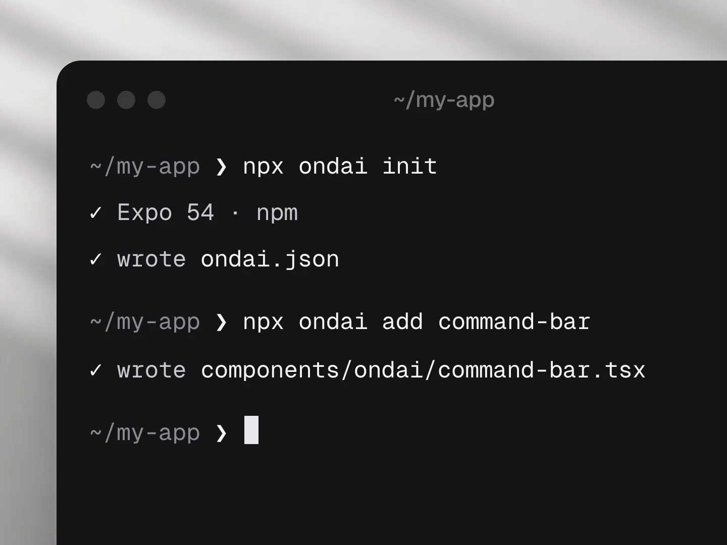
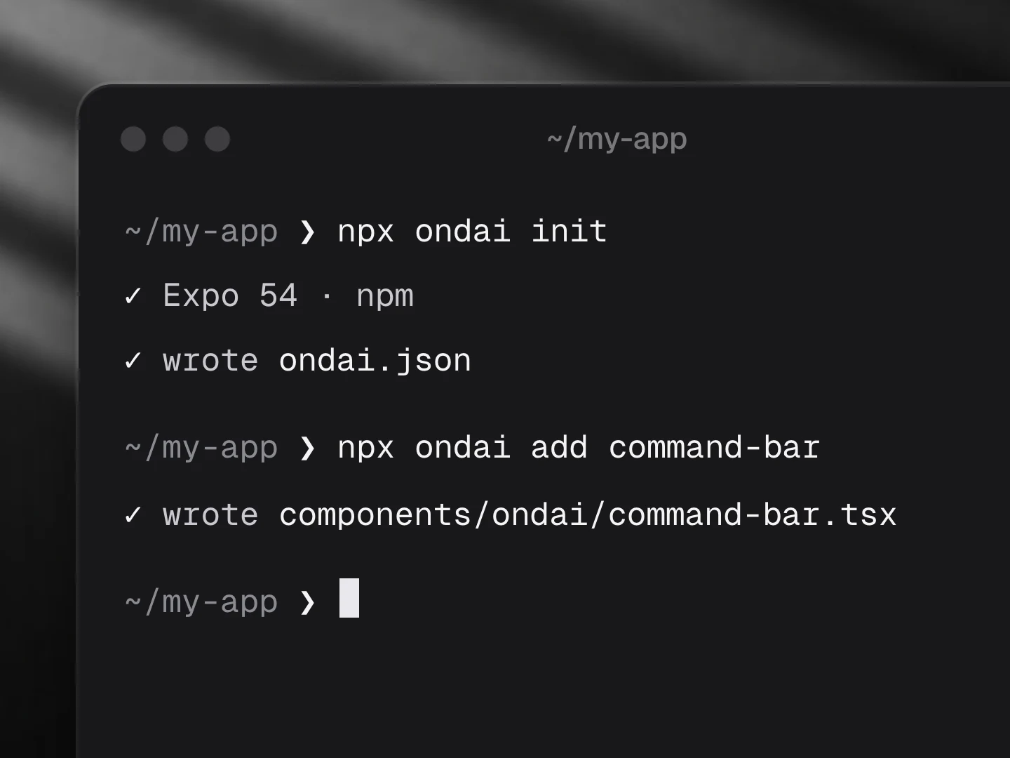
npx ondai add tone-checkUsage
import { ToneCheck } from '@/components/ondai/tone-check'

<ToneCheck value={draft} onAccept={setDraft} />- Tones:
friendly,neutral,blunt,tense, plus formality from casual (0) to formal (1) and a short note on how the message may land. - Runs after a pause in typing (
debounceMs, default 700) once there areminChars(default 12) characters. A stale reading dims and its knobs spring to the new one, so the meter moves instead of jumping. offTones(default['blunt', 'tense']) decide when a softer version is offered.suggest="auto"writes it straight away,suggest="tap"waits for the Soften key,suggest="off"only reads.- Headless:
useToneCheck()returnsreading,suggestion,phase,isOff,check(text)andsoften(text).
Customize
Every AI component takes the same look and customization props, so it fits your app rather than ours.
<ToneCheck
  variant="pop"
  tint="#FF5A5F"
  size="lg"
  radius={12}
  icons={{ blunt: CircleAlert, soften: Wand2 }}
  labels={{ blunt: '…', accept: '…' }}
/>| Prop | What it does |
|---|---|
variant | The look of the whole component: clean, minimal, glass, pop, candy, metal, shine, bevel |
size | sm, md, lg; type, the pill, the meters and keys scale together |
tint | Any colour; the variant paints its keys in it. Tone colours stay semantic |
radius | Corner radius of the card |
icons | Replace any icon (a lucide component, an element, or null to hide it): friendly, neutral, blunt, tense, soften, accept, reject, retry |
labels | Every visible and spoken string; defaults are exported as toneCheckLabels: title, friendly, neutral, blunt, tense, warm, sharp, casual, formal, formality, thinking, softening, idle, softer, soften, accept, reject, retry, preparing |
| Slots | Draw a part yourself: renderMeter, renderSuggestion |
styles | Style any named part |
Variants
| Prop | Options |
|---|---|
variant | clean, minimal, glass, pop, candy, metal, shine, bevel |
presentation | card, pill |
size | sm, md, lg |
Token budget
Input budget: 1800 tokens. The draft is truncated to half the window so the softer rewrite fits in the rest; the reading is a small JSON object.
Fallback
When structured output is not available the reading falls back to three plain lines (tone:, formality:, note:). When no provider is ready the component shows the unavailable copy, or the download bar while a model prepares.
Files
Registry dependencies: button, model-download, on-device-badge, shimmer-text, streaming-text, surface
npm dependencies: @ondai/core, @ondai/tokens, expo-haptics, lucide-react-native, react-native-reanimated, zod