Theming
Void, Paper and Glass themes, accent presets, and the token package.
Everything is built from @ondai/tokens: a 12-step cool gray scale, one accent gradient reserved for AI states, semantic colors, Geist Sans and Geist Mono, a 4pt grid, radii, elevation and springs.
<OndaiProvider value={ai} theme="void" accent="ion">| Theme | Use |
|---|---|
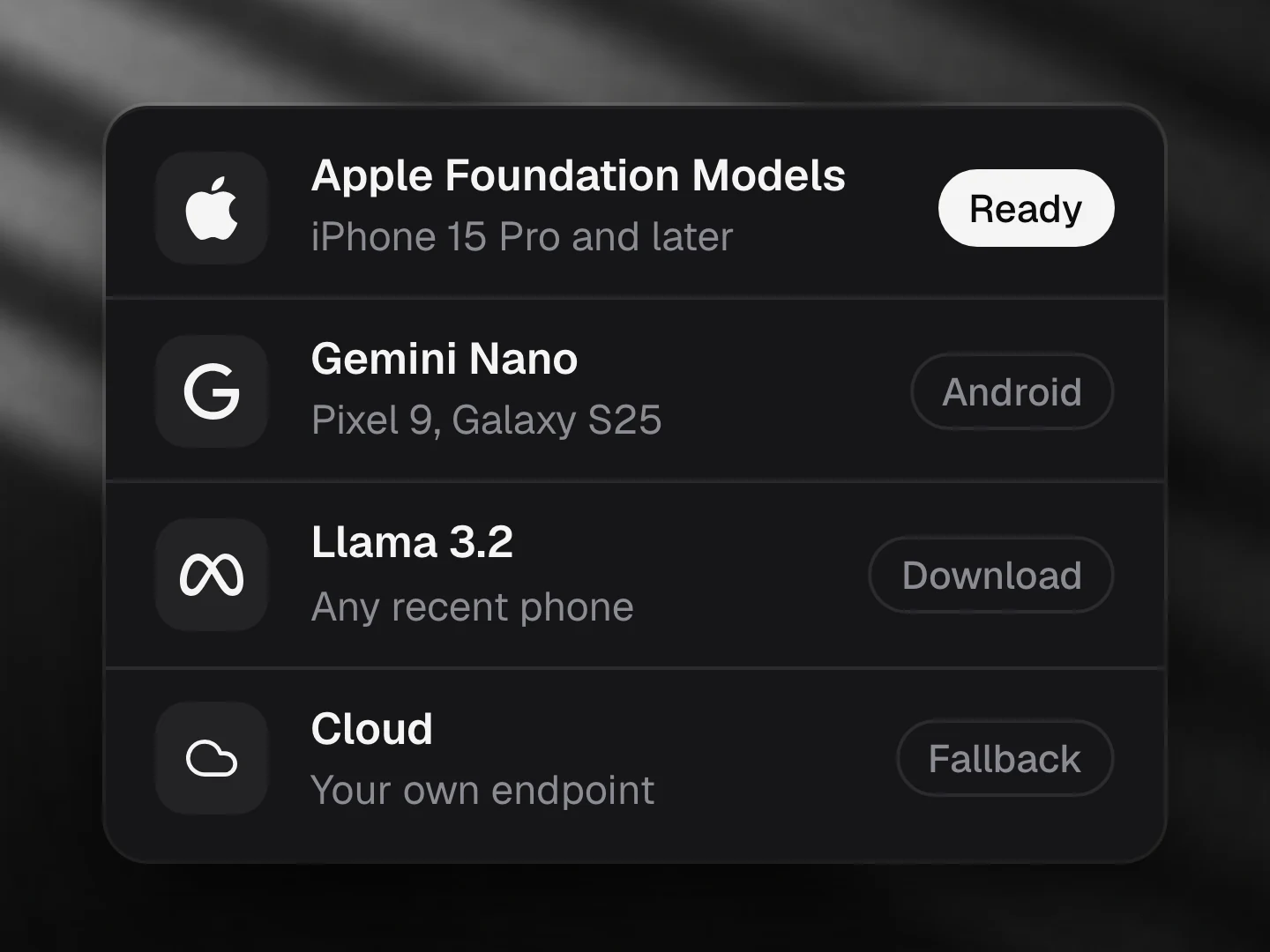
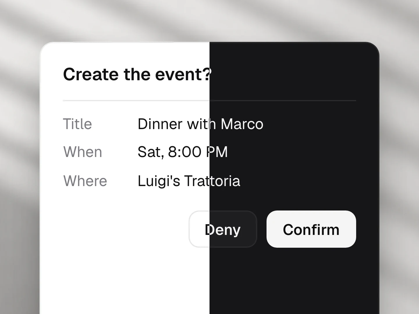
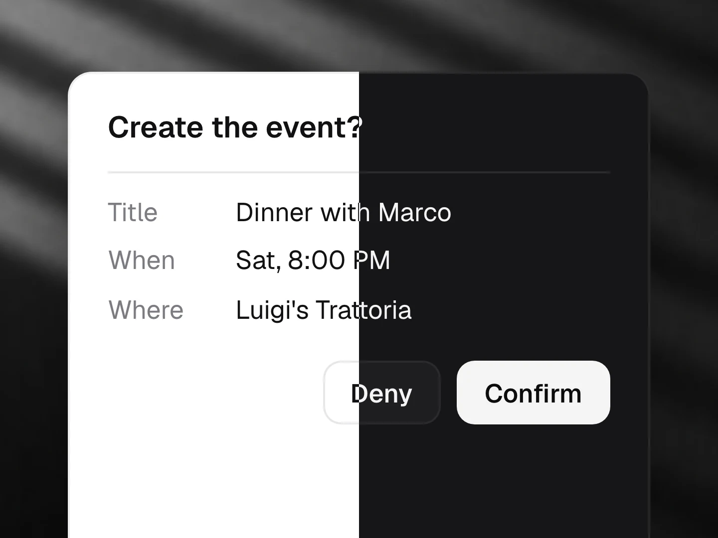
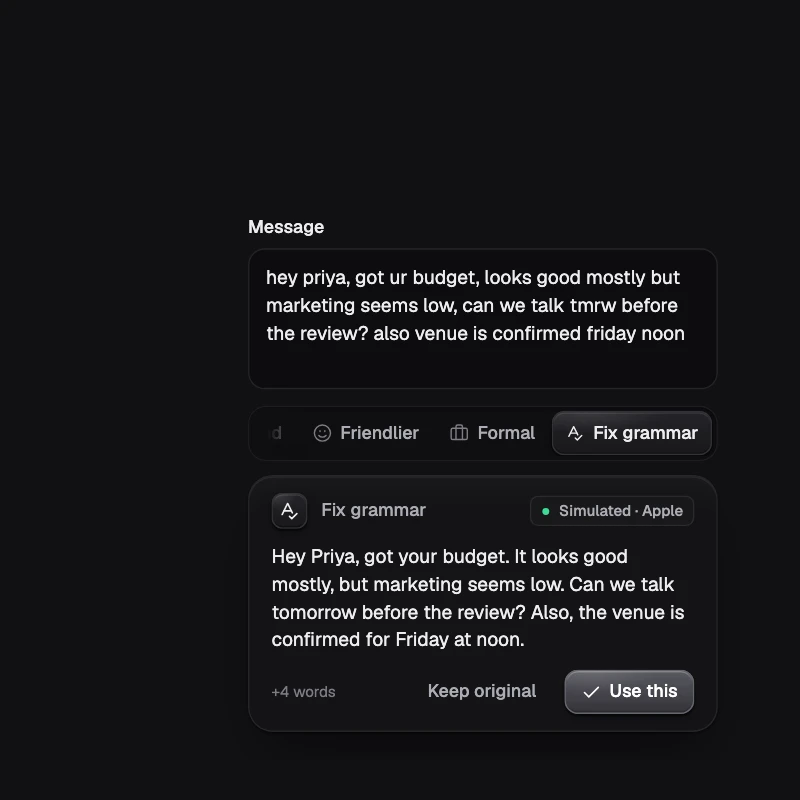
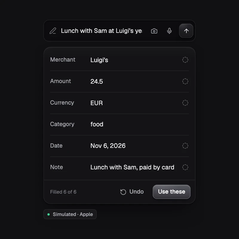
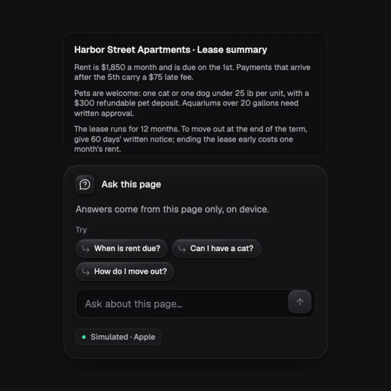
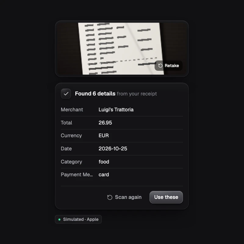
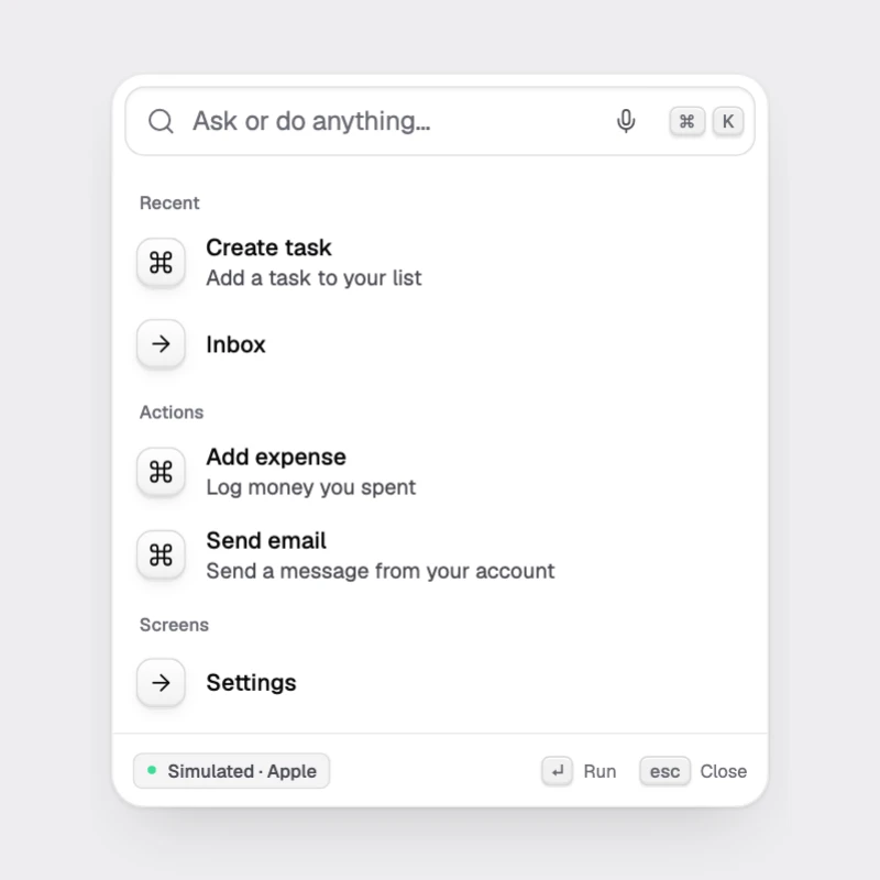
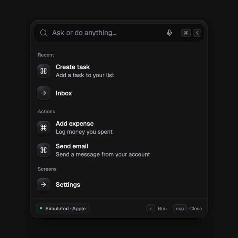
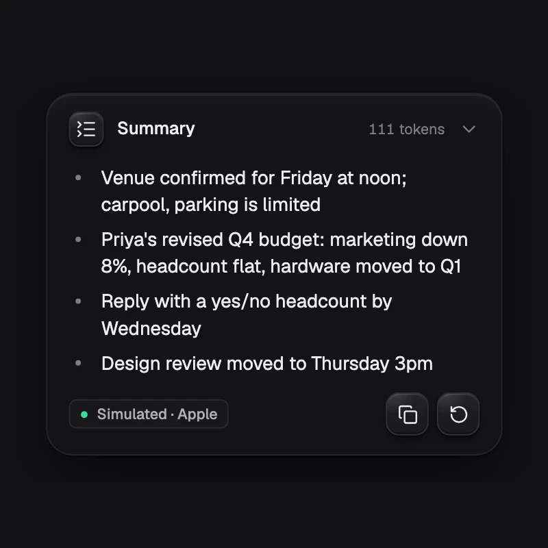
void | Dark, the default. #07080A background, hairline borders. |
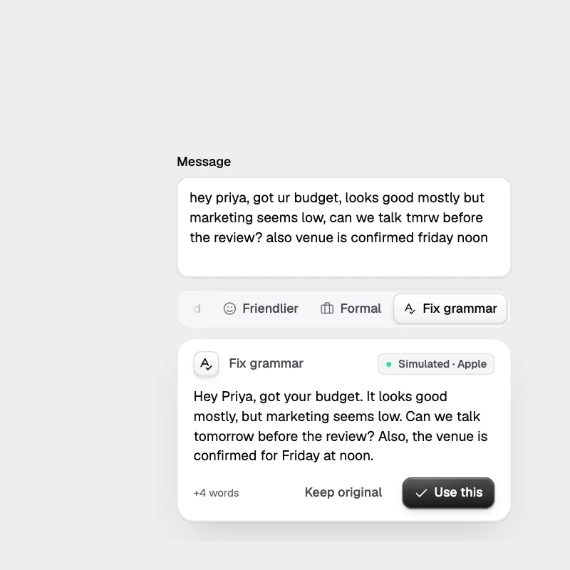
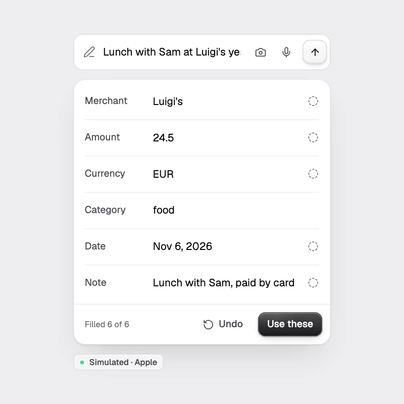
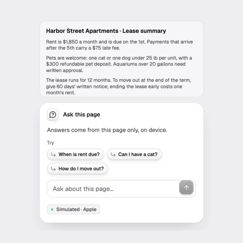
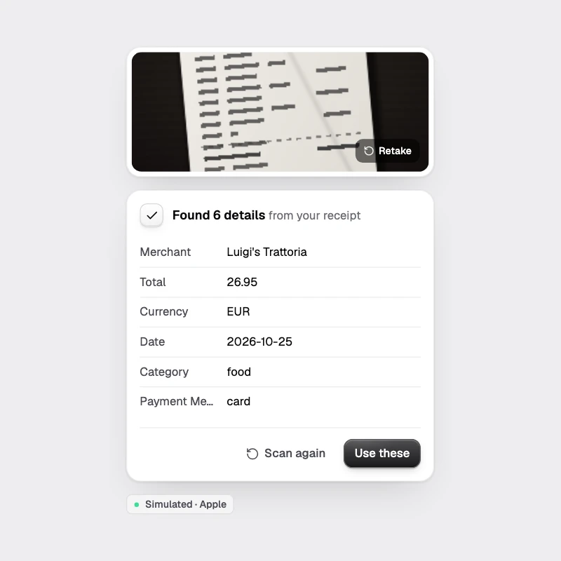
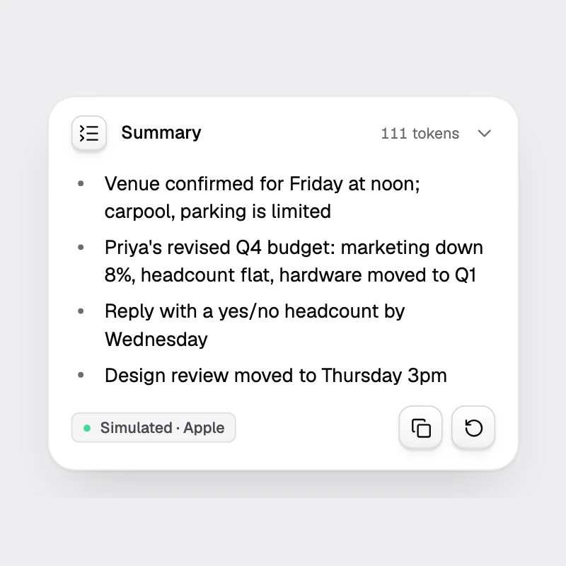
paper | Light. |
glass | Translucent surfaces with blur over app content. |
system | Follows the OS. |
Accents: ion (cyan → violet → magenta, the default), mono (white or black only), aurora (green-teal), ember (orange-red), or custom with three stops.
The accent is only for AI states: thinking borders, the streaming caret, the badge dot, focus rings on AI inputs. Everything else stays monochrome.
Using the tokens in your own UI
import { useTheme, typeStyle } from '@ondai/tokens/react'
const t = useTheme()
<Text style={[typeStyle(t, 'md', { weight: 'medium' }), { color: t.colors.text }]} />
On NativeWind or react-native-reusables, @ondai/tokens/tailwind-preset maps the palette onto the shadcn variable names. @ondai/tokens/css generates the CSS variables for the web.