Ask page
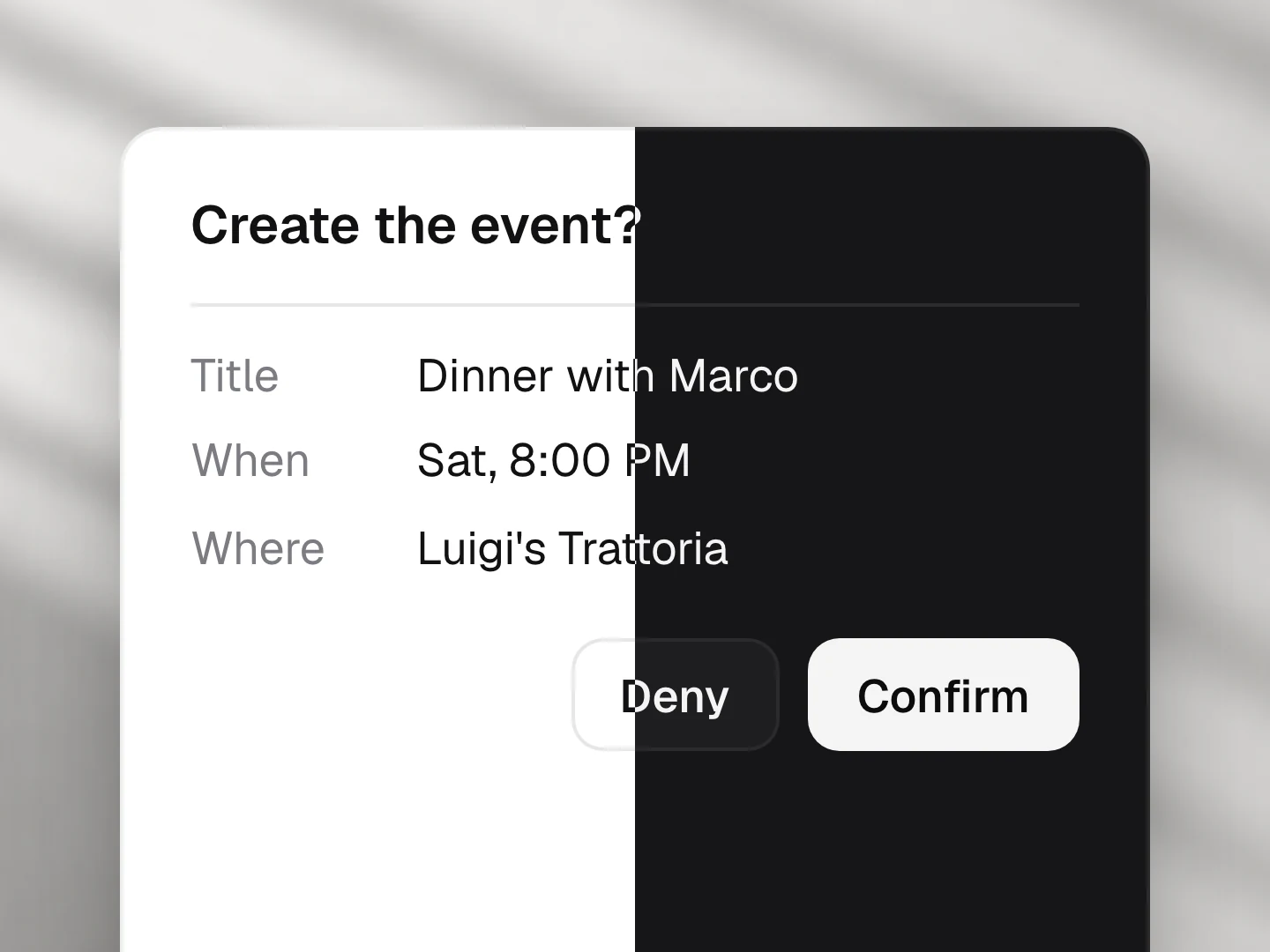
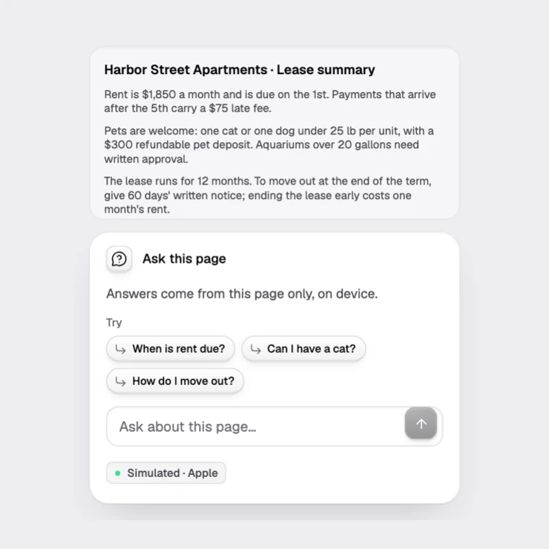
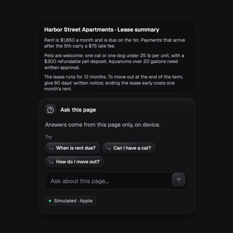
Ask about the page on screen. The answer streams in grounded in its text, with tap-to-jump quotes and follow-ups, and says when the page does not hold it.
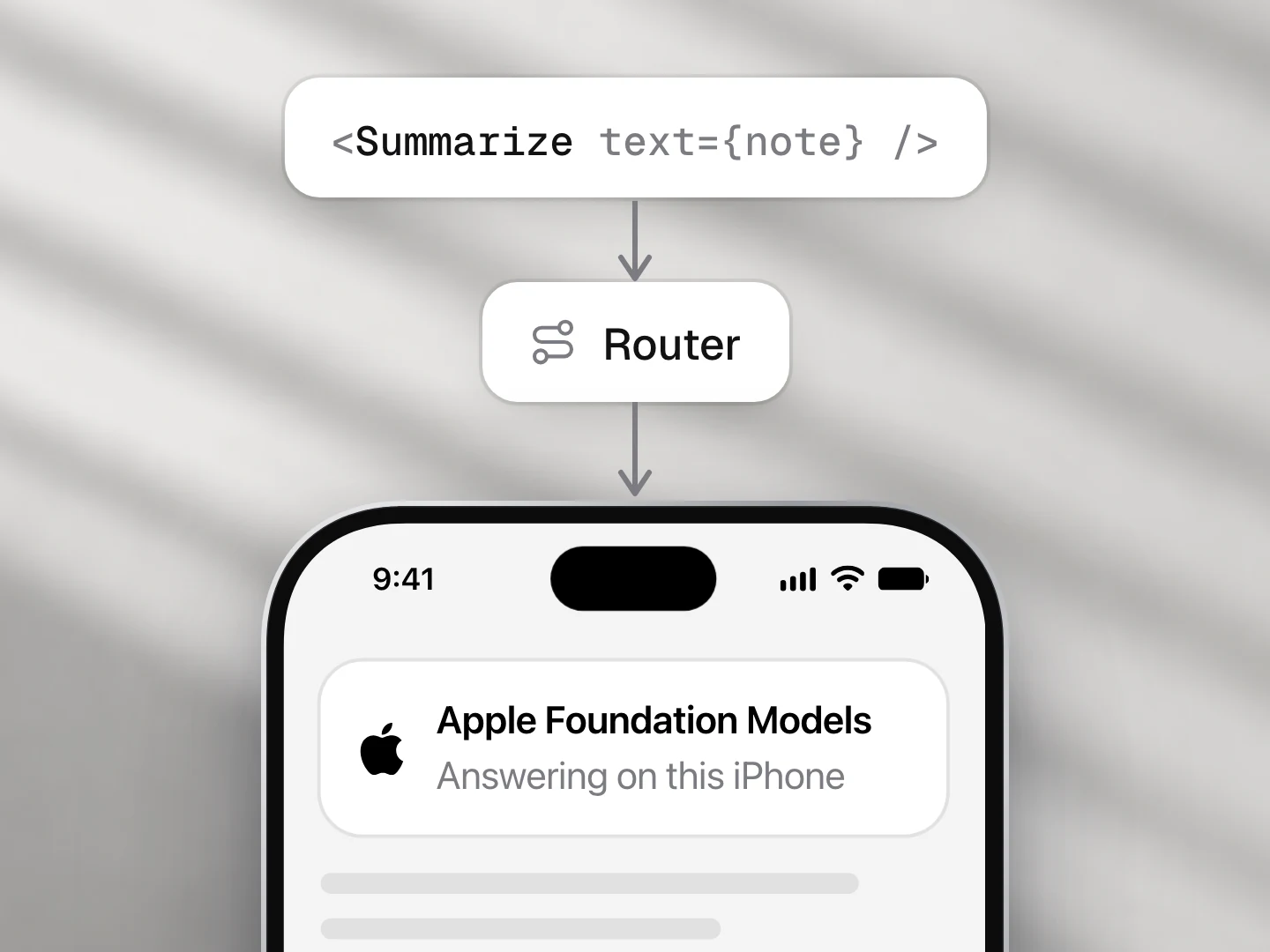
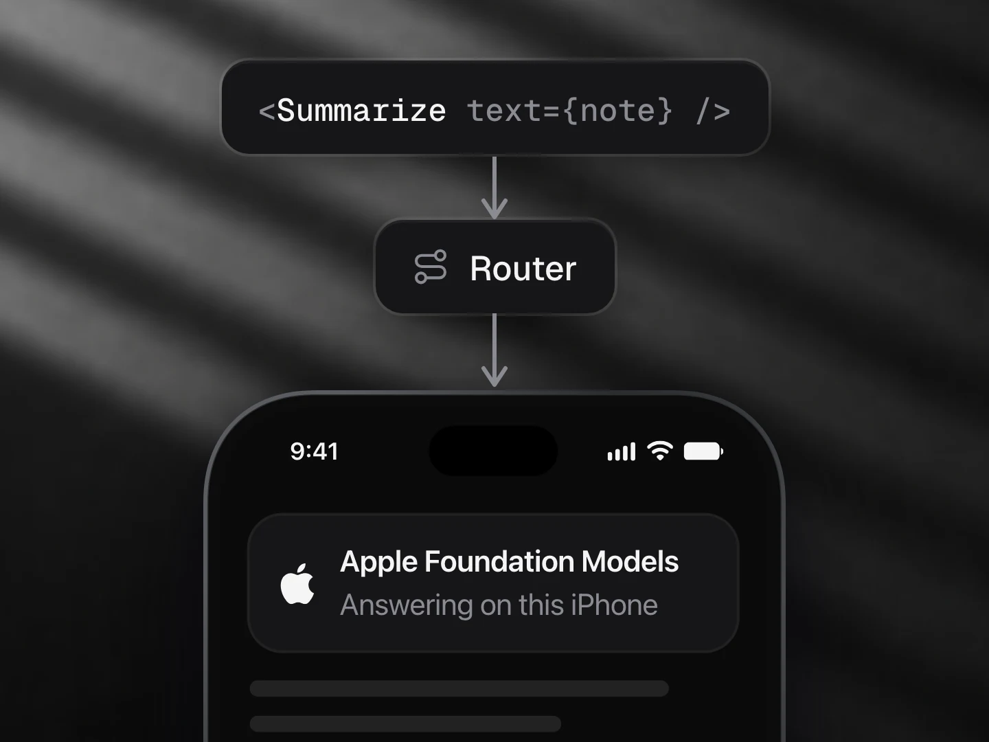
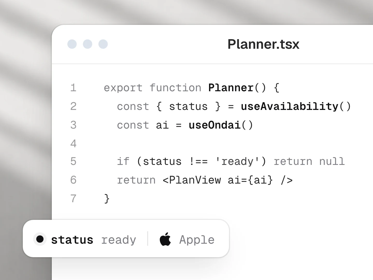
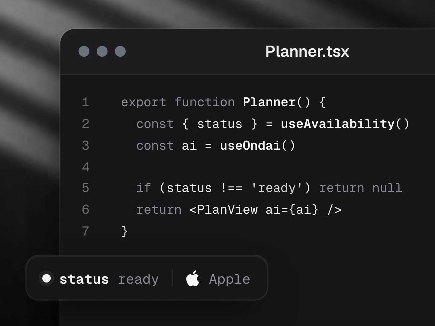
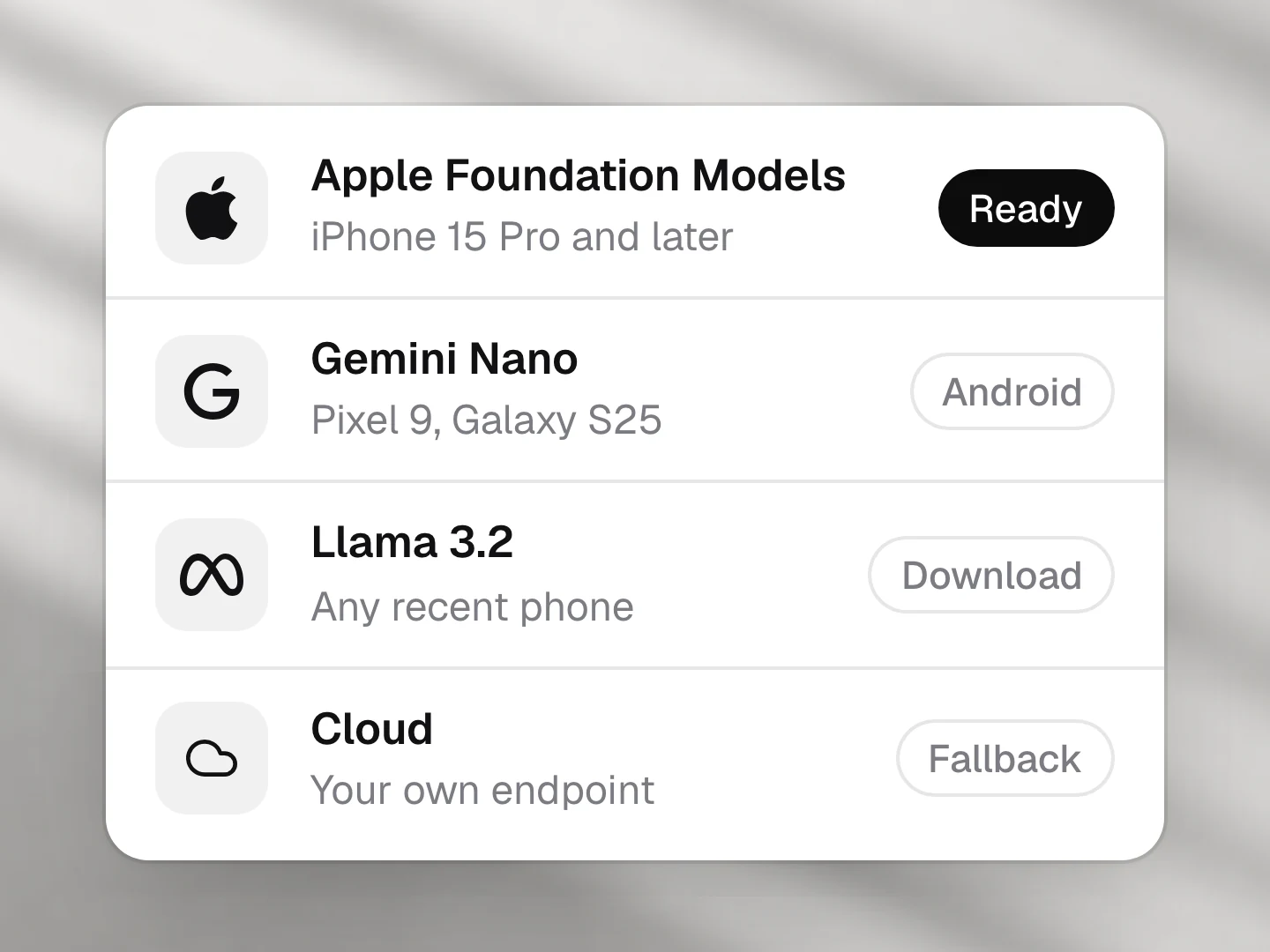
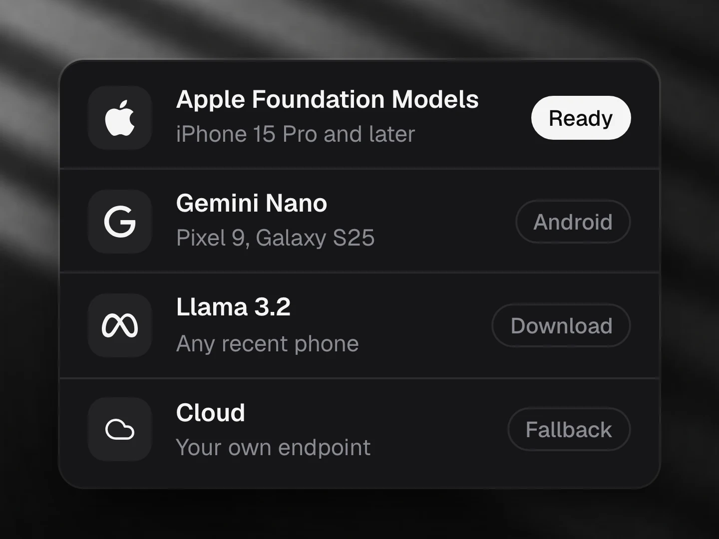
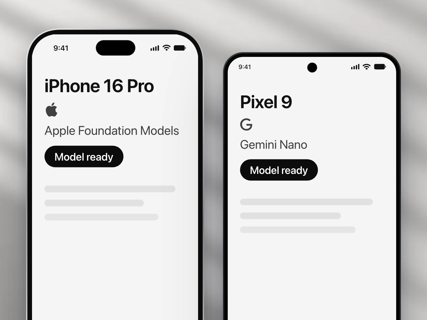
- Apple Foundation Models: supported
- Gemini Nano: supported
- Llama (not yet supported): not supported
- A cloud model: supported
Install
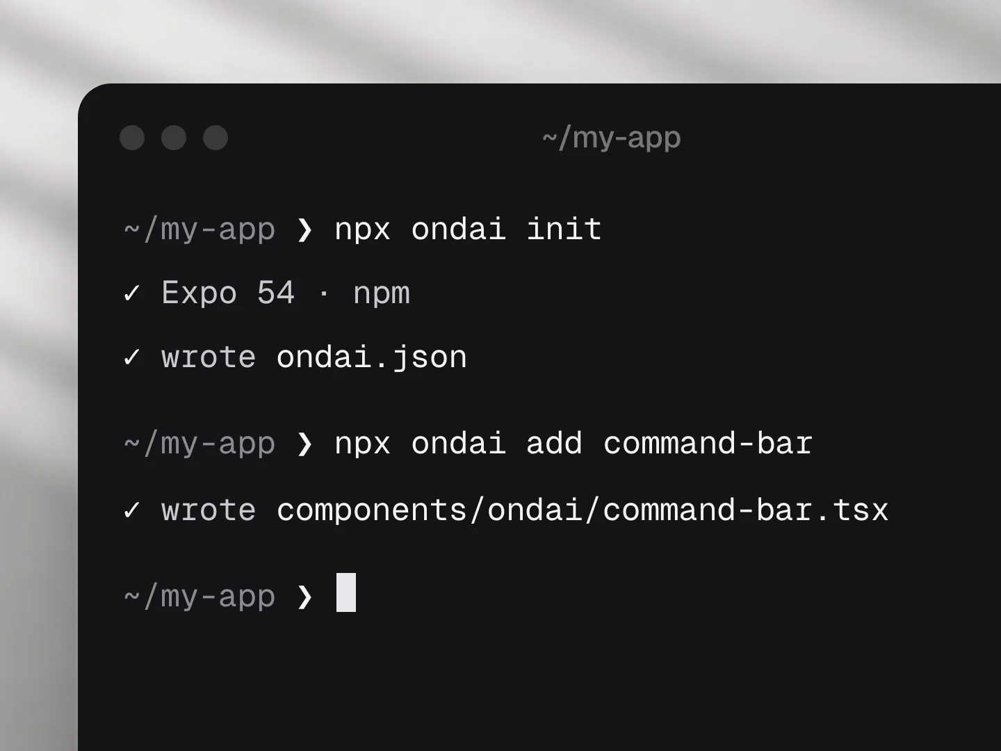
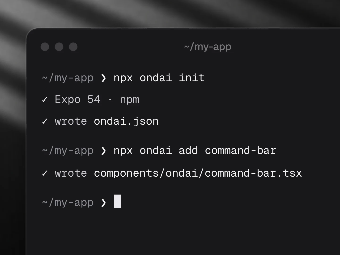
npx ondai add ask-pageUsage
import { AskPage } from '@/components/ondai/ask-page'

<AskPage
  text={article.body}
  pageTitle={article.title}
  suggestions={['When is rent due?', 'Can I have a cat?']}
  onJump={(quote) => scrollToOffset(quote.start, quote.end)}
>
  <Article />
</AskPage>- The answer comes from
textonly. The model also returns short quotes, and each one is checked against the page: an exact match (ignoring case and spacing) is kept with itsstartandendoffsets, a paraphrase is matched to the closest sentence, and anything that is not in the page is dropped. - Tapping a quote calls
onJump(quote, index), so the app can scroll to the passage and highlight it. - When the page does not hold the answer, the model says
NOT_IN_PAGEand the component shows Not in this page rather than a guess, with your starter questions to try instead. - Follow-up questions come back with the answer; tapping one asks it.
useAskPage()exposes the same logic headlessly;parseAnswer,locateQuoteandexcerptForQuestionare exported too.
States
idle, thinking, streaming, done, notFound, error, refusal, unavailable, preparing.
Customize
Every AI component takes the same look and customization props, so it fits your app rather than ours.
<AskPage
  text={page}
  variant="pop"
  tint="#FF5A5F"
  size="lg"
  radius={12}
  quoteStyle="rule"
  icons={{ title: BookOpenText, followUp: null }}
  labels={{ title: '…', notFoundTitle: '…' }}
/>| Prop | What it does |
|---|---|
variant | The look of the whole component: clean, minimal, glass, pop, candy, metal, shine, bevel |
size | sm, md, lg; type, field, quotes and keys scale together |
tint | Any colour; the variant paints its keys, tiles, quote marks and glow in it |
radius | Corner radius of the container |
icons | Replace any icon (a lucide component, an element, or null to hide it): title, send, stop, quote, jump, followUp, notFound, retry |
labels | Every visible and spoken string; defaults are exported as askPageLabels: title, placeholder, idle, suggested, thinking, quotes, jump, followUps, notFoundTitle, notFoundHint, trimmed, retry, preparing, send, stop, inputLabel |
| Slots | Draw a part yourself: renderQuote, renderFollowUp, renderAnswer, renderEmpty, renderNotFound, renderError |
styles | Style any named part |
Variants
| Prop | Options |
|---|---|
variant | clean, minimal, glass, pop, candy, metal, shine, bevel |
presentation | card, inline, sheet |
quoteStyle | cards, rule, chips |
size | sm, md, lg |
Token budget
Input budget: 3400 tokens. The whole page goes in one streamed pass when it fits; otherwise the chunks that best match the question are sent, in page order, and a quiet note says so. Quotes are always checked against the full page.
Fallback
When no provider is ready the component renders the unavailable state (AvailabilityGate copy) and the field is disabled; while a model downloads it shows the progress.
Files
Registry dependencies: button, chip, model-download, on-device-badge, sheet, shimmer-text, skeleton, streaming-text, surface
npm dependencies: @ondai/core, @ondai/tokens, expo-haptics, lucide-react-native, react-native-reanimated